Updating your bathroom décor can often feel like a daunting task. Choosing the best paint colors for an almond or bone bathroom can be even more of a challenge, especially when the goal is to strike a balance between aesthetic appeal and relaxation.
But here’s the good news – various options beautifully complement these soothing hues and help create a calming atmosphere.
Trust me; after all, don’t we all want a bathroom that serves its functional purpose and offers us an escape from our hectic day-to-day lives?
If you’re looking for ways to enhance your almond or bone-color-themed bathroom, you’re in the right place.
This blog post aims to enlighten you about some fantastic color palettes that can work cohesively with your existing scheme. So without further ado, let’s dive into the world of colors and discover how they could transform your space into an oasis of tranquility.
Contents
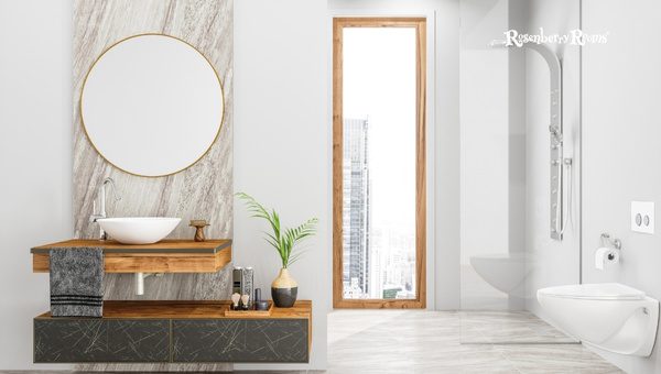
Before you rush out and grab the first paintbrush, it’s essential to consider some elements. The right color selection isn’t just about finding one you love – it’s about finding one that enhances and enlivens your space. So, here we go.
In general, lighter colors can make a small bathroom seem more extensive and more open. On the other hand, dark hues could shrink space even further. If your bathroom is spacious, you can experiment with deeper shades.
However, don’t wipe dark colors off your list entirely if your bathroom is small! Strategic use of ‘pops’ of dark color against an otherwise light backdrop can also create an eye-catching contrast.
Look around your bathroom – the sink, tub, and tiles are all part of your canvas. If these are already in almond or bone shades, then congrats.
You have an excellent neutral base already set up. Now it’s about choosing colors that complement these fixtures instead of clashing against them.
Whether serene and calming or bold and inviting – what’s the mood you’re going for? Light blues or soft greens might lean towards a tranquil spa-like vibe, while vibrant colors like yellows or oranges might evoke a warm sense of energy.
Selecting contrasting colors creates visual intrigue in any room but be cautious not to go overboard. Stick to two high-contrast colors maximum for smaller bathrooms to avoid overwhelming sight lines.
It’s usually best to pick one dominant color (almond or bone), with several supporting hues making up the rest of the color palette.
By keeping these factors in mind while considering the unique features of an almond or bone-colored bathroom, you can shortlist options that meet your desired aesthetic vibes effectively.
Now let’s delve into some handpicked selections that beautifully suit an almond or bone bathroom setting.
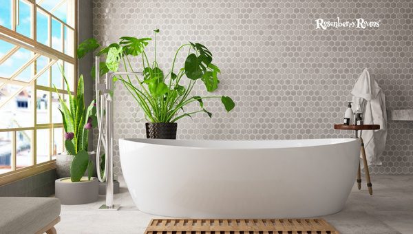
Finding the perfect paint color does more than please the eye; it brings together the style and theme of your bathroom.
Let’s begin our adventure with my top three picks for the best paint colors to update an almond or bone bathroom, with a timely emphasis on their features.

Mixed with walnut undertones balancing grey and beige, Sherwin Williams Mega Greige SW 7031 is a versatile choice for your bathroom.
It blends effortlessly with both almond and bone fixtures. This color embodies relaxation, considered a warm greige (a sophisticated blend of gray and beige).
Key Features:

Benjamin Moore’s Revere Pewter is an incredibly popular greige that perfectly balances gray and beige. Offering an earthy feel that echoes natural stone elements – think pebbles smoothed by river waters – this color radiates harmony.
Key Features:

This excellent creamy off-white color by Benjamin Moore provides just the right amount of warmth to meld naturally with an almond or bone bathroom setup.
Neither overly bright nor too dull, White Down OC 131 projects quiet elegance and understated sophistication.
Key Features:
From warm greiges such as Sherwin Williams Mega Greige SW 7031 to muted neutrals like Benjamin Moore’s Revere Pewter HC172 or creamy options like Benjamin Moore’s White Down OC131 – there are numerous shades out there that can beautifully blend with your almond or bone-themed bathroom fixtures.

Tony Taupe, a part of Sherwin William’s family of captivating greige shades, exudes an understated elegance that pairs perfectly with an almond or bone bathroom.
Key Features:

Presenting Smoked Oyster by Benjamin Moore: A sultry shade that is bold without overwhelming – ideal for those seeking an unconventional appeal while retaining an elegant vibe.
Key Features:

For those drawn towards the classic gray spectrum’s deeper end, consider Kingsport Gray HC 86 from Benjamin Moore. Packed with warmth despite its dark appearance, this color can add remarkable depth to your space.
Key Features:
Choosing aptly from these potential best paint colors gives you a fantastic canvas working smoothly with your almond or bone chromatic scheme and ensures your little piece of heaven called ‘bathroom’ personifies you in essence! A perfectly painted bathroom truly is art brought to life through color.
It’s crucial to note that while many colors can beautifully compliment almond or bone bathrooms, others can have the reverse effect.
They may appear dirtier against these hues and detract from their appealing features. That’s why I have shortlisted some colors you might want to avoid.
Note: It’s always advisable to test patches before committing fully to ensure that your chosen hue accurately matches your vision.
When deciding on the perfect paint color, it can help to have comparable hues that showcase diversity and a vast realm of possibilities.
If you found my previous color recommendations interesting, here are more almond or bone bathroom options.

Sherwin Williams’ Amazing Gray is an essential middle-of-the-road hue known for its moderate tone that bridges the gap between dark and light grays.
Features:

Sherwin Williams’ Jogging Path is a verdant, earthy neutral – influenced by trails winding through the forest.
Features:

Fieldstone by Benjamin Moore is named after rustic stone walls – reflecting warmth while retaining elegance.
Features:

As its name suggests, Sherwin Williams Creamy offers a neutral cream base with understated yellow undertones.
Features:
I hope you find these selections beneficial when discussing enhancing your bone or almond-themed bathroom decor.

Sherwin Williams White Duck is undoubtedly a vital tool in the arsenal of any person looking to infuse a unique charm into their bathroom décor.
An off-white shade with a creamy, warm undertone, this color caters perfectly to pair with almond and bone elements.
Features:

Benjamin Moore’s Stone Harbor – this mid-toned grey shade provides a soothing backdrop in any bathroom.
Features:

Silver Fox by Benjamin Moore is an effortlessly stylish choice that imparts an aura of luxury to your space.
Features:
Detailed information on Benjamin Moore Silver Fox is available on their webpage.
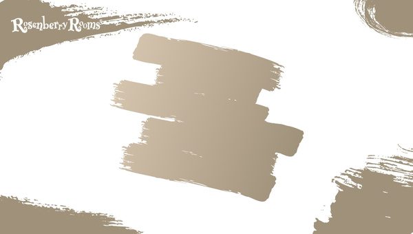
A favorite among those seeking tranquility from their space – Sherwin Williams Portico offers muted tones of beige and green to create something truly unique.
Features:
Sherwin Williams’s Portico is easily accessible for deeper exploration through its website.
Consider the size of the bathroom, existing fixtures, desired mood, and how colors complement each other.
Warm colors work well with almonds or bone because they harmonize with these shades, creating a soothing environment without overwhelming the space.
The perception of color can change depending on the lighting. Natural light brings out the most accurate color, while artificial lighting can slightly alter the colors.
Consider painting larger surfaces like walls in lighter shades, and use deeper hues sparingly for accents to create visual interest without disrupting harmony.
Absolutely! An intelligently used high-contrast hue can elevate your bathroom’s outlook by providing a visually intriguing pop against your primary scheme.
Transforming your almond or bone-colored bathroom into a serene sanctuary is enjoyable when you understand the diverse color palette options.
Whether it’s Sherwin Williams Mega Greige, Benjamin Moore’s Revere Pewter, or some other combination – the right paint colors can add depth and elicit various moods in your bathroom.
Always remember that color selection isn’t merely about aesthetics. It’s about creating an ambiance that relaxes you and makes you feel at home.
Don’t hesitate to embrace a bit of contrast and complexity in your color palette – it often makes for some of the most striking combinations.
With this guide as a starting point, I encourage you to embark on your exciting journey of exploring colors for your haven: your bathroom! Happy coloring!