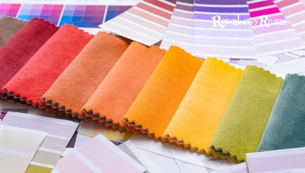
As winter draws to a close and the first buds of spring begin to appear, many of us feel inspired to bring fresh air into our homes.
This is where the magic of spring-inspired paint colors enters the picture. This seasonal palette encapsulates the vibrant and rejuvenating spirit of nature’s rebirth and promises to add an exciting pop of freshness to any place you call home.
Fresh blooms and bright sunlit days are the essence of spring, and nothing can better embody this cheeriness than colors that reflect that optimistic energy.
Now is the perfect time to lean into softer tones or dip your toe into a daring bright hue. Let me guide you through some fantastic “spring-inspired paint colors” that refresh your interiors in sync with the world outside your window.
20 Best Spring-Inspired Paint Colors
This season, incorporate the spirit of rejuvenation and vibrancy into your spaces with these 20 top-notch spring-inspired paint hues.
1. Sherwin Williams Vaguely Mauve SW 6015
Wilting cherry blossoms against a clear blue spring sky bring this beautifully understated shade from Sherwin Williams to mind.
As its name suggests, Vaguely Mauve leans into the mauve spectrum but with an enthralling touch of subtlety. As one of the best-matched paints for spring inspiration, there’s a depth to this color that is mentally calming and visually inviting.
2. Sherwin Williams Kestrel White SW 7516
Kestrel White by Sherwin Williams is a timeless classic blending the warmth of a sunny spring day with cool elegance. A soft off-white hue evokes images of cotton blooms basking in the gentle early morning sunshine.
- Spaciousness: Kestrel white can give any space an instant appearance of expansiveness, even within smaller room sizes.
- Versatility: It quickly acclimatizes with varying lighting conditions and room themes- modern minimalistic or rustic chic.
- Backdrop Brilliance: The understated classiness makes it an excellent backdrop against which vibrant accents stand out vividly.
3. Benjamin Moore Muskoka 974
Benjamin Moore’s Muskoka reincarnates those first signs of awakening nature typical to spring mornings – dew-kissed leaves and branches under the soft sunlight. Its mossy undertone makes it unique in its rendition of earthly lushness.
- Aesthetic Harmony: Sophisticated yet earthy, this color pairs beautifully with materials like wooden furniture or brass décors and blends right in with greenery outside your windows.
- Ambiance Amplifier: Muskoka imbues a sense of tranquility & centeredness in space.
- Flexible Background: Just as with Kestrel White, Muskoka can become a serene setting against which bolder artworks or colorful tapestries can be showcased.
Remember, these are just three out of hundreds: explore other brands while giving your homes that ‘spring’ makeover.
4. Benjamin Moore White Down OC-131
Meet Benjamin Moore’s White Down OC-131, a robustly warm and inviting white shade that mimics the soft light of early spring.
It exudes an aura reminiscent of the residual morning frost grappling with the first hints of warm sunlight on a crisp spring day.
- Exceptional Versatility: White Down lends itself admirably across surfaces, from extensive wall spans to kitchen cabinetry and wardrobes to subtle trims.
- Room-Widening Effect: Its inherent brightness expands perceived room dimensions, making it an excellent choice for smaller, compact spaces.
- Neutral Background: This color is aesthetically flexible as it offers an uncomplicated background that allows other design elements like décor or furniture color profiles to stand out.
- Warm winter’ Hue: The light cream nuance embedded within the whiteness reflects ambient light, beautifully emulating that ‘still winter but slightly warming up’ ambiance apt for a tranquil bedroom or cozy living area.
5. Benjamin Moore Dried Parsley 522
The Dried Parsley 522 is another Benjamin Moore gem capturing that delicate balance between shades of green in the aftermath of a welcoming spring shower. Think of spots of sunlight filtering through overgrown ivy leaves onto your patio stones.
- Natural Aesthetic Aura: This distinctive earthy tone embodies an intense connection with nature’s rejuvenating spirit ideal for spaces dedicated to ‘serenity.’
- Pairing Potential: The vibrant hue makes it optimal for pairing with lighter neutrals or deeper shades like browns or beige furnishings, adding depth and dimension.
- Versatile Use Cases: Dried Parsley adorns varied spaces, from accent walls and doors to window frames with aplomb.
6. Sherwin Williams Atmospheric SW 6505
Sherwin William’s Atmospheric Sw 6505 paints images of clear blue spring skies on cloudless days. Its soothing effect is akin to monumental ice glaciers patiently awaiting their turn towards melting under warmer daylights.
- Relaxation Inducing Essence: The calm demeanor injects tranquility into the space, making it perfect as a bedroom or bathroom wall paired with white linings.
- Flexibility in Pairing: Despite its distinctive personality, ‘Atmospheric’ pairs well with both vibrant as well as neutral palettes
- Elegance Booster: This paint can effortlessly pump up elegance within spaces with sheer curtains and minimalist furniture.
7. Benjamin Moore Misty Blue 820
Misty Blue 820 by Benjamin Moore perfectly captures those foggy hill trails witnessing their first hint of waking spring – subdued yet supremely refreshing.
- Uniquely Uplifting Effect: Despite its softer undertone characteristic of pastel palettes, ‘Misty Blue’ doesn’t fade into obscurity but exhibits a confident, uplifting presence.
- Teaming Potential: It teams up superbly with lighter chromes like off-whites and deeper neutrals (think cool grays), offering remarkable versatility.
- Pairing Prodigy in Big & Small Spaces Alike: From petite powder rooms alongside rustic timber accents to spacious halls paired against lush indoor plants – there’s hardly any miss from Misty Blue.
8. Sherwin Williams Pressed Flower SW 6304
Spring is synonymous with the eruption of colors as dormant flowers bloom, welcoming the warm sunlight, a feeling captured soulfully by Sherwin Williams in their ‘Pressed Flower‘ paint.
This color brings a hint of romance and nostalgia with its rosy undertone reminiscent of dried rose petals pressed into an old beloved book.
Key Features and Highlights:
- Subtle Elegance: Its toned-down pinkish hue exudes a refined elegance and complements both modern and rustic interiors beautifully
- Ambiance Set-Up: Ideal for creating a calming, serene ambiance in bedrooms or study rooms, it holds an innate ability to inspire creativity.
- Flexibility in Pairing: Pressed Flower teams amazingly well with various other shades like muted greys, crisp whites, or even dark charcoals highlighting its incredible adaptability
- Accent Wall Worthy: Its unique personality allows it to stand out charmingly as an accent wall color without becoming overly dominant
- Nostalgic Nuances: With Pressed Flower on your walls, you extend spring beyond its calendar time frame right into your home through its perpetual floral freshness
9. Benjamin Moore Simply White Oc-117
Warm hues of early morning sunshine dancing off white gardenias have been bottled into Benjamin Moore’s ‘Simply White‘ paint.
Yet this ‘simple’ white packs plentiful subtleties that unfurl beautifully under different ambient light conditions.
Key Features and Highlights:
- Versatility to Boot: Adaptable across spaces large or small, Simply White delivers that touch of sophisticated simplicity like no other
- Multipurpose Usage Scenario: Showcased just as readily on ceilings as on walls or trimmings – you can’t go wrong with selecting Simply White, regardless
- Backdrop Brilliance: As a background shade, it enables eye-catching highlight colors (artwork/ upholstery) to pop effortlessly, lending depth to your living spaces
- Warm Aesthetic Tones: Despite being labeled ‘white,’ there’s an inherent creaminess that lends warmth without undercutting the brightness quotient
10. Sherwin Williams Drift Of Mist SW 9166
Drift Of Mist from Sherwin Williams pulls at your heartstrings like the sight of distant mountains shrouded in the early morning fog. A warm undertone weaves through this soft grey, imbuing a sense of quiet tranquility.
Key Features and Highlights:
- Visual Expander: Its light color profile visually expands rooms making them seem airy and spacious
- Multipurpose Powerhouse: Use Drift Of Mist imaginatively from expansive wall coverage to striking room trims
- Blendability Factor: This shade blends seamlessly well with deeper neutral palettes lending natural depth & dimension
11. Sherwin Williams Pinky Beige SW 0079
Pinky Beige from Sherwin Williams channels springtime nostalgia captured within sun-soaked antique pages.
The warm tone strikes an excellent balance between pastel peach & earthy beige with an unexpected dash of muted pinks strewn in.
Key Features and Highlights:
- Ideally versatile: Pinky Beige lends itself generously across stylistic choices, be it classic country-style cottages or modern minimalist apartments.
- Gentle Monochromatic: Combining Pinky Beige alongside varying shades from the beige spectrum can manifest dynamic monochromatic settings.
- Contrast Crafting: It also pairs contrasting darker greens/browns phenomenally or stands out as pop-out accents.
Remember, spring portrays nature’s magical transformation wrapped in serenity & brilliance – it’s genuinely inspiring if these symbolic elements echo off our walls embracing our interiors too.
12. Benjamin Moore Pale Moon OC-108
Step into the dusky glow of the Pale Moon OC-108 from Benjamin Moore. Its soft, warm undertone recreates a serene spring evening when day and night meet halfway in an almost mystical interplay of nature’s hues. This color echoes ethereal twilight landscapes bathed in surreal silver-gold moonlight.
Features and highlights:
- Subtle Warmth: The shade delivers a subtle warmth that imbues spaces with a relaxed and peaceful ambiance.
- Adaptability: It can be utilized judiciously in any house room, commendably adjusting itself to the room’s light and shade dynamic.
- Complementing Nature: Pale Moon excels with the natural wooden color profiles or indoor greenery, introducing a layer of intimate outdoor-indoor connection.
- Swap Elegance for Glamour: Pair it with metallic accents or vibrant accessories; you’ll have an instant mix of glamour and elegance right before your eyes!
13. Benjamin Moore Stokes Forest Green 2035-40
Look no further than Benjamin Moore’s Stokes Forest Green if you fancy replicating an audacious spring forest theme within your abode.
It is a robust reiteration of mature evergreens standing tall against fierce spring winds casting their majestic green shadows underneath that famed forest canopy.
Features and highlights:
- Bold Aesthetic: This deep, luxurious shade effortlessly creates bold aesthetic statements.
- Ultimate Focal Accent: Stokes Forest Green works excellently as the main accent wall against lighter-themed décors.
- Flexibility: Use it sparingly for trims or enthusiastically across expansive walls – it rewards amplitude or restraint equally well.
14. Benjamin Moore Northern Lights 586
This whimsical hue from Benjamin Moore mirrors the magnificence of its namesake —the Northern Lights— to infuse spaces with enigmatic enchantment akin to witnessing that magical play of colors in a serene spring night sky.
Features and highlights:
- Dreaminess: The dreamy violet undertone subtly uplifts one’s mood acting as subliminal therapy.
- Application Diversity: Be it tiny recreational nooks inside your house or larger expansive areas craving that distinctive persona — Northern Lights adapts stunningly.
15. Benjamin Moore Fernwood Green 2145–40
The Fernwood Green by Benjamin Moore breathes life into static interiors like sprightly fern leaves busying themselves under gentle spring rain showers.
It’s a sophisticated hybrid between bright grass green & time-honored olive green —nostalgic yet full of zing!
Features and highlights:
- Garden Fresh: Its fresh vibrancy echoes nature at its best, sharing outdoors’ reviving charm directly within your living spaces.
- Flexible Pairing Options: Whether paired against contemporary grayscale profiles or traditional wooden tones — Fernwood Green assumes coordination roles effortlessly.
- Intriguing Dual Personality: Despite its underlying brightness, it retains remarkable adaptability to assume different personalities under changing lighting conditions, increasing its intrigue quotient.
16. Sherwin Williams Spare White SW 6203
Sherwin Williams Spare White Sw 6203 paints a picture of untouched snow finding respite under frail, budding springtide branches.
Now imagine the first dewdrop of spring rolling down a pristine white flower petal – that is SO ‘Spare White’!
- Versatile: The ultimate choice for various uses – think large walls, ceilings, trims, or cabinetry.
- Sophisticatedly Simple: This hue is simple and sophisticated at once – it instills spaces with an effortless statement of poise and class.
- Superb Illumination: Its ability to reflect light beautifully brings a sense of brightness to any room.
- Subtle Compliment Gathering Color: Its subtlety complements various color profiles brilliantly. Yet, it can become the eye-popper when paired with deeper contrast shades like blues or grays for trims & borders.
17. Benjamin Moore Windmill Wings 2067-60
Invoking images of illustrious tulip fields kissing clear blue spring skies under radiant sunshine is Benjamin Moore’s Windmill Wings 2067-60.
- Eye-Catching Charm: This inviting blue-purple hue never fails to impress visitors.
- Visually Expansive: Exhibits surface-doubling visual treats in smaller spaces such as powder rooms or hallways.
- Combination Genius: Magnificently complements neutrals, woods, and metals, enhancing the sophistication quotient.
18. Benjamin Moore Cappuccino 2096-50
Reciting tales of cloudless sunlit afternoons spent gazing out from under dense canopy shadows onto vibrant nature trails is Benjamin Moore’s Cappuccino 2096-50.
- Dramatic Yet Sedate: This warm espresso shade encapsulates richness and drama without being too overwhelming – it achieves an alluring balance!
- Comforting Backdrop: It works perfectly as a backdrop against which bright furniture or lighting fixtures stand out effectively
19. Benjamin Moore Weston Flax HC-5
Weston Flax HC-5 by Benjamin Moore elegantly echoes those lazy brunches enjoyed amidst blossoming fields gently rocked by mild spring breezes.
- Natural & Radiating Warmth: Weston Flax emulates late spring’s full bloom, exuding warmth with natural elegance.
- Friendly Presence: This shade integrates seamlessly with varied interior styles thanks to its friendly demeanor.
- Eternal Classic: It creates classic interiors oozing timelessness without ever going obsolete regarding changing trends
20. Sherwin Williams Ivorie Sw 6127
Ivorie SW6127 by Sherwin Williams materializes dreamy visions of dew-soaked Lily petals silently echoing dawn choruses against mild sun rays.
- Gracious Aesthetic: It conveys an aura that’s at once elegant and welcoming, perfecting that ‘sophisticated comfort’ ambiance within homes
- Unobtrusive Versatility: Its unobtrusive personality allows it to pair beautifully with darker woods or vibrant upholstery, surprising you with its versatile range of imitations.
Why is Sampling the Most Important Step Before Settling on the Paint Color?
Selecting a paint color for your space is more than just a fleeting aesthetic decision. It directly impacts how you perceive and experience that space every day.
Here’s why I always insist on experimenting with paint samples before purchasing your chosen entire lot of paint:
- Perceived Vs Actual: Paint colors can drastically vary from digital representations or tiny sample cards to actual manifestation once applied on larger surfaces. Computer screens or sample cards can mimic palettes unreliably due to differing light conditions, angles, or even screen calibrations.
- Contextual Delivery: In certain lighting environments or against specific décor/furnishing materials (think wooden Vs metallic), the same color may appear different. A lively shade under store lights may appear washed out under evening indoor lights.
- Mood Mapping: Different colors ignite different emotional responses in humans, what might initially ‘appear’ pleasant might ‘feel’ otherwise when applied over large spaces. Trying out samples allows you to assess whether your chosen color effectively aligns with the ambiance/mood you desire.
Hence, before proceeding with gallons of a selected paint color based on online catalogs/ store brochures, it might be productive (and economical) to sample them first-hand within your intended space(s).
You would be surprised at what these quick strips of experimentation could save you – regarding resources and satisfaction.
FAQs About Spring-Inspired Paint Colors
What are spring-inspired paint colors?
Spring-inspired paint colors are hues that echo the vibrancy and freshness of the spring season, typically including light pastels, earthy neutrals, and bold, vibrant tones.
Are spring-inspired paint colors suitable for any room?
Absolutely! From airy bedrooms to cozy living rooms, the versatility of these hues allows them to complement virtually any space in your home.
Do spring-inspired colors lighten up a room?
Yes, light or softer shades from the spring palette can give an illusion of spaciousness and inject brightness into a room.
Can I pair these colors with existing furniture, or do I need new furnishings?
Spring-inspired hues pair well with various materials and color profiles – from wooden to fabric or even metallic finishes – making them quite adaptable!
Is trying a sample before settling on a color necessary?
Sampling is highly recommended – it helps assess if the ‘real’ shade, once applied, aligns with your expectations and complements your space’s lighting and decor.
Conclusion
Every year, as spring paints our outdoors in heartwarming vitality, it’s only natural to want a piece of that blooming charm captured within our homes too.
Spring-inspired paint colors offer the perfect way to cultivate these seasonal vibes indoors. Embracing hues symbolic of the season’s vitality and renewal can significantly alter spaces – making them appear, fresher, brighter, and intrinsically positive.
Sampling such hues is essential in ensuring you appreciate the significant role lighting and surrounding décor play in your color’s final rendition.
So, before you crack open those more giant paint cans, remember to dab a bit on your walls first! Finding the perfect shade might be a journey.
But once you stumble upon ‘the one,’ every moment spent sampling becomes worth its weight in gold. Happy painting your ‘spring’ into fruition.
