Deciding on a color for your shutters can be one task that feels overwhelming, given the array of options available.
After all, the color you choose can significantly impact your home’s overall aesthetic and curb appeal. So, how to pick shutter colors that work perfectly with the rest of your property and suit your style?
Welcome to ‘Color Therapy 101,’– where we will discuss shutter colors, from factors affecting your decision to tips on choosing the right hue.
We aim to navigate you through this world of limitless possibilities because we understand how critical exterior details are in setting the right ambiance for a warm welcome home. So grab a cuppa, sit back, and explore those colors.
Contents
Creating a great first impression of your home begins at the curb. The right shutter colors can have a tangible impact, dialing up the curb appeal of your property.
How, you ask? Well, your shutters are the makeup for your house, adding color and character to its ‘face’. Boldly colored shutters catch the eye and add vibrancy to an otherwise plain exterior, while neutral tones help create an elegant and subtle look.
Besides, they serve as an excellent window frame while preserving coherence with the overall physical structure. It’s truly remarkable how this touch of color beautifully emblazons your house in a ‘picture-perfect’ way.
Deciding on the ‘perfect’ shutter color entails more than picking a shade that catches your fancy. Considering several factors, It would be best to have efficient judgment and creativity.
One thing is clear: choosing shutter colors is not simply about aesthetics—it’s about creating harmony between various elements that lead to an attractive overall presentation.
Shutters bring sophistication to your home, banking significantly on your chosen color. Let’s discuss some time-honored favorites that often grace the exteriors of homes far and wide.
When choosing between neutral and bold shutter colors, you’ll want to consider your home’s style and desired visual impact.
Neutral colors are timeless choices that appeal due to their versatility. Think black, white, or earth-toned shades like beiges and browns – these tend to blend harmoniously with traditional architectural styles while also able to stand alongside more contemporary looks as well!
Additionally, neutral colors tend not to overwhelm the structure’s existing hues but rather enhance them subtly pleasingly.
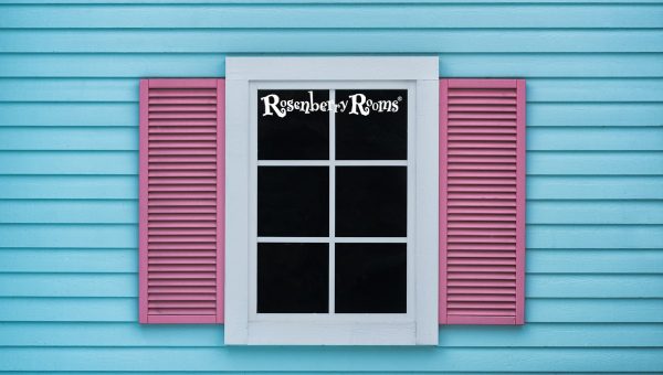
Let’s discuss bold choices- vibrant reds, deep greens, blues, or even spirited oranges! Choosing bold hues is all about creating contrast for visual interest while adding some personality flair to your home’s facade!
But remember: going bold requires balance; ensure these standout shades sync well with other external elements like siding color or garden landscaping!
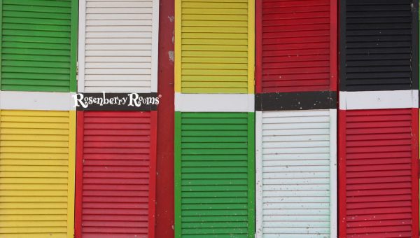
From classic blacks and creams to unique blues and dramatic reds, countless shutter colors are just waiting for you!
Choosing the right one can seem daunting, but when done right, it becomes an opportunity for creative experimentation, further elevating your home’s curb appeal.
Choosing the right shutter color warrants thoughtful consideration, and it’s not limited to personal likes or dislikes.
Many factors can influence your decision, which is vital in ensuring curb appeal and the perfect balance between aesthetics and functionality. Let’s explore some key elements.
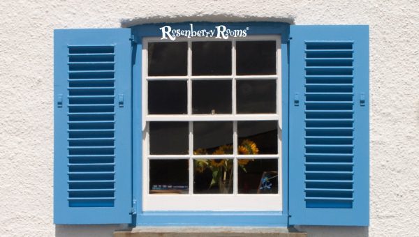
Coordination is key. This isn’t merely a fashion rule but a design principle that holds for exterior décor. Imagine your trim as a picture frame – it is as essential as the picture itself that your shutters should complement.
Generally, shutters and trim painted the exact color blur boundaries, creating fluidity – excellent for tiny homes to appear larger!
But if you’re drawn to contrast, don’t shy away from using different colors for the trim and shutter. Contrasting colors here articulate architectural details vividly. Maintaining visual harmony or engaging contrast is essential to ensure aesthetic cohesion.
The core soul of your house is its architectural style – be it Contemporary, Victorian, Classical, or Craftsman.
Each has inherited aesthetic traditions translating into specific exterior color schemes and combinations.
For instance:
The choice extends beyond historical accuracy; it’s about capturing an architectural mood accentuating your home’s unique character.
Hence keep this in mind: While choosing shutter colors seems like an exciting palette play (which it is!), it’s also about maintaining alignment with your home’s inherent architectural style.
Understanding the existing exterior colors of your home is critical when choosing your shutter colors. You want your shutters to complement, not clash with, the current palette.
Let’s examine this further:
Remember: continuity and consistency are essential—all elements must tie together seamlessly for a cohesive look.
Lighting conditions can significantly affect how color looks and feels on your shutters. The same shade may appear different under various lighting; daylight Vs evening twilight or bright sun Vs overcast skies.
Some points to ponder:
So before you decide on a shutter hue – test out different samples at various times of day, considering each’s unique lighting impact!
Although individuality holds high esteem when personalizing our homes, it’s wise not to disregard one more aspect – neighborhood aesthetic cohesion.
None of us fancy looking like an oddball in our neighborhood! Adopting bold colors or radical contrasts might seem enticing but consider this first—are these in line with other homes around? Will they blend harmoniously with the neighboring aesthetics?
Therefore:
You’ve achieved neighborhood conformity while still maintaining individuality.
Ultimately, shutter colors are an expression of personal style and taste. Still, considering existing exterior colors, local lighting conditions, and neighboring aesthetics will ensure personally pleasing decisions and visually synchronized with their surroundings.
We’ve talked so far about factors that influence choosing shutter colors, discussing how vital harmony and aesthetic compatibility are when finalizing your decision.
With a clear understanding of the basics, we now focus on sharing some practical tips to simplify the process further – emphasizing effective color testing methods, the wonders of modern technology, and some invaluable expert guidance.
First and foremost: Test before you finalize. Sampling a palette of colors under different lighting conditions is imperative. Grab several paint chips or small color boards depicting the hues you have in mind for your shutters.
Mount these samples on your exteriors next to window frames, and observe from different angles during the day as lighting changes from dawn to dusk.
Assess how well each color harmonizes with siding, roof tile, and other exterior finishes across varied light conditions.
From brighter mornings to sunbathed afternoons or dusk blues—each lighting scenario will present a unique interplay of shades that can guide you toward picking the perfect hue.
This is a boon to homeowners and paint professionals—these tools help visualize different paint hues on shutters without physical application!
Users upload photos of their homes onto design apps/websites (like Sherwin-Williams Visualizer or Benjamin Moore Personal Color Viewer) and virtually ‘paint’ their shutters from comprehensive shade libraries.
This digital visualization lends an initial reality check on how a particular shade might look against your home’s backdrop—saving countless hours of manual labor testing physical swatches.
But remember, monitor calibration varies! Use this primarily for initial short-listing: real-world testing is non-negotiable.
While personal judgment is commendable, seeking professional advice can bring forth a well-rounded perspective involving years of expertise.
Professional designers often have an intuitive understanding of creating visual balance with colors; their suggestions can assist you in pairing just-the-right shade to strike the perfect chord.
Similarly, experienced painters possess knowledge about undertones, finish types, and color longevity—rich insights that equally contribute to your decision-making process.
Ultimately, let’s not forget who truly rules the roost – You! Your shutter colors should indeed mimic your personality.
Your color choices speak volumes about you: bold, adventurous souls might fancy vivid hues, while calm personas tend toward softer shades.
It would be best to consider practical aspects like maintenance effort—a busy lifestyle could prefer shades that keep signs of weathering or successful repairs less conspicuous.
So go ahead – incorporate your essence, add your story into the mix, because at day’s end—it’s ‘your home sweet home.’
When it comes to shutter color selection-always trust your instincts but never forego meticulousness- we test & assess as we’re expressing ourselves; we consult & visualize because each element plays towards constructing that perfect picture that we call ‘home.’
Finding the right shutter color to enhance your home’s façade can be a joyful, sometimes complex, journey.
With myriad combinations, it helps to understand what shutter colors work best with particular houses. For today, let’s focus specifically on tan and brick houses.
Tan houses emanate a warm, welcoming aura that spells simplicity yet elegance. The versatility of this shade provides a visually pleasing canvas allowing numerous charming combinations for your shutters.
Here are some quick picks:
Remember: Variation in saturation matters! Tan has many variants, from a light creamy tan to an earthy deep tan—each necessitates meticulous analysis before picking the right color combination.
Regardless of your choice, ensure a distinct enough contrast between your home’s color and shutter colors for that eye-catching effect.
Ah! The charm of a brick house. With their visually rich textures and traditional appeal, brick houses hold an undying allure that is hard to resist.
Selecting shutter colors here requires some thought as you’d ideally want them to complement the natural warm tones inherent in bricks.
Let’s check out some suitable choices:
However: Consider brick tone variety, ranging from deep reds to light browns or even multi-colored. Coordinate appropriately while ensuring sufficient contrast between your walls and shutters.
When choosing shutter colors for different houses, consider the underlying factors such as material type, primary house color (siding or brick), neighborhood aesthetic style, and your taste!
These parameters must combine to create pleasing exterior aesthetics resulting in beautiful curb appeal!
As you embark on this colorful journey remember – no rule is sacrosanct! Blend prescribed norms with personal creativity because eventually, it’s ‘your home,’ ‘your style’ that makes all the difference!
Traditionally, Yes, shutters often matched the trim. This approach created uniformity and continuity, reinforcing your home’s overall aesthetic.
However, design norms have evolved today, and shutter colors can be chosen independently, allowing for a broader scope of creativity.
The customary thought was to have trim, shutters, and sometimes even doors of the same color. This widespread practice helped unify a house’s exterior elements and maintain visual continuity.
Remember this societal norm:
Here is a table for a quick recap:
| Traditional Approach | Modern Approach |
|---|---|
| Shutter matches trim | Shutter contrasts/complements trim |
| More uniform look | More distinctive look |
| Elegant & understated | Bold & eye-catching |
Remember that there are no hard-and-fast rules. In modern design principles, many homeowners choose contrasting colors for their shutters and trim to accentuate architectural elements further.
In fact:
Color blocking techniques, using contrasting shades for doors, windows, and trims, are increasingly popular today—adding dynamic visual interest!
Therefore: Whether matching or contrasting your shutters with your trim entirely depends on your home’s architectural style and personal preference too!
Ultimately choosing shutter colors is about striking that perfect balance between consistent harmony and bold vibrancy—offering an inviting declaration of your home’s persona right from the street!
Pro tip: Try leveraging digital paint visualization tools to perceive better how different combinations might appear.
Indeed the game of colors is tantalizing—one color swap and boom, you transform your humble abode’s ambiance from monotonous to magical!
Shutters, though seemingly trivial components of a house’s exterior, can significantly impact its overall aesthetic appeal. Their color is critical in highlighting architectural features and creating a unified exterior appearance.
Architectural elements are the skeletal framework contributing significantly towards your house’s uniqueness.
And one striking way you can put these into the spotlight is by strategically choosing shutter colors to highlight them.
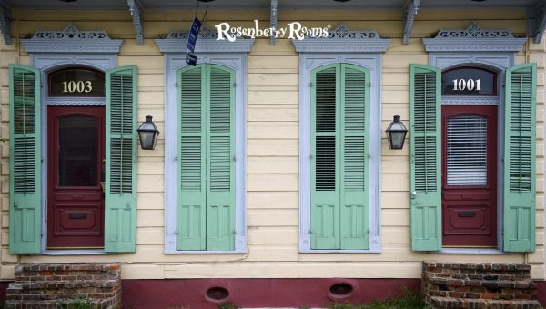
For instance, in houses with decorative trims, moldings, or intricate brickwork patterns—often painting your shutters in bold contrasting colors like merlot red or cobalt blue fosters focus on these features. The pop of color works wonders—a magnet attracting eyes towards alluring details otherwise inconspicuous.
Similarly, opting for lighter shades against darker exteriors allows striking window designs to be emphasized—acting as picture frames and breathing life into these masterpieces!
The beauty here lies in customization and flexibility—you can accentuate whichever architectural feature you deem worthy! So embark on this soulful journey of crafting that dazzling dreamscape home—let it be a beacon of unique charm!
Creating visual harmony is an artful task. A balanced color palette instigates uniformity—a soothing undercurrent flowing across diverse architectural elements, unifying them into one cohesive whole.
Shutter colors are pivotal for creating this integrated look—they’re that magic wand which, when swirled adroitly:
Imagine those earthy green shutters merging silently with surrounding foliage, seamlessly unifying nature and nurture! Or think about Tuscan yellow-dyed boards brightening up stone-clad houses, adding that sunny sparkle.
Yes, they can! Choosing a contrasting color for your shutters often provides a dynamic, appealing look to your exterior.
While it’s not a rule, shutters that match or complement your front door or window trim can create a visually balanced and coordinated curb appeal.
Absolutely! The roof is a significant part of your home’s visual field and should harmonize with whatever color you select for your shutters.
Using bold or contrasting shutter colors puts the spotlight on particular architectural details. Lighter shades against a darker exterior help emphasize striking window designs.
Yes, maintaining neighborhood aesthetic cohesion is advisable. However, it’s essential to incorporate unique elements that reflect your style.
Choosing the right shutter color is an art that requires much more than a basic understanding of colors. It demands careful consideration of various aspects, including architectural style, existing exterior colors, roof color, and even the neighborhood aesthetic.
The right shutter color boosts your home’s curb appeal exponentially and lets you highlight architecturally pleasing details and weave a unified aesthetic tale.
Remember, your home’s exterior is your first impression on anyone visiting or passing by. So why not make it unforgettable through wisely chosen shutter colors?
Rather than making hasty decisions that you may regret later, consider all the abovementioned factors. And then let those shutters work their magic, enhancing your humble abode’s charm.