Choosing the perfect color scheme for your home can be tricky and requires supreme artistry, thoughtful reflection, and insight.
There's a subtle elegance about choosing a neutral palette, it offers a classy backdrop while leaving room for stunning furniture, intricate woodwork, and captivating artwork to star.
The vast spectrum of the best mushroom paint colors is one of my all-time favorite hues to blend sophistication with an earthy touch.
These shades blend the warm undertones of taupe and beige with just a hint of gray. A brilliantly versatile tone that works well in every nook and corner of your home, automatically transforming it into a stylish sanctuary away from the everyday hustle-bustle.
Mushroom paint colors are undoubtedly an indulgent treat for those who love timeless elegance with an out-of-the-box edge.
Contents

Mushroom paint colors are a fascinating fusion of taupe, beige, and gray tones. They fittingly derive their name from the shade of portabella mushrooms.
Surprisingly versatile, this color family masterfully straddles between warm and cool shades bringing an attractive charm to any room.
Unlike stark grays or browns often found in neutral schemes, Mushroom paint carries an elegant richness with layered tones.
This depth and texture create an ethereal connection between the organic world and our living space, which is undeniably mesmerizing yet aptly subdued.
There are several truly remarkable benefits to choosing mushroom colors that make it a popular choice for home designs.
These strikingly multi-faceted hues offer both aesthetic allure and practical advantages that won't go unnoticed.
Harnessing the benefits of mushroom paint colors can easily breathe new life into your home, providing a refreshing makeover without overwhelming your spaces. Their charm lies deep within this delicate balance.
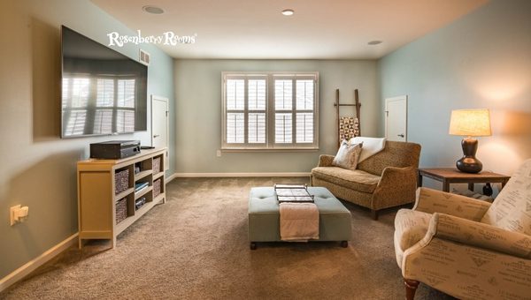
Delving into the mushroom-tone universe can bring surprising delights that manifest in a gorgeous range of options.
Yet, some are the absolute favorites for their captivating charisma, versatility, and timeless appeal. Let's explore these star performers.
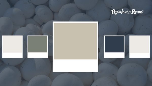
Undeniably one of my favorites in mushroom hues, Mushroom SW 9587 is a classic that remains extraordinarily relevant in modern design. The beautiful synergy of gray and beige lends a unique elan to this color.
The depth and richness naturally incorporated in Mushroom SW 9587 set it apart in creating sophisticated spaces with an organic feel.
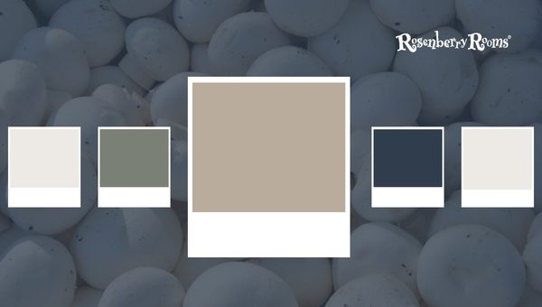
The serene allure of Balanced Beige SW 7037 is genuinely captivating—it's warm yet immensely neutral. The delicate balance between beige and tan undertones provides an insubstantial cool edge without being overbearing.
A versatile player like Balanced Beige SW 7037 readily adapts to your changing design desires over time without demanding a complete makeover!
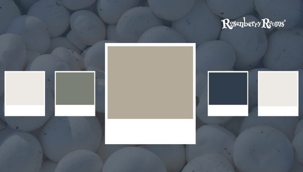
Pashmina AF-100 skillfully embraces a captivating charm coupled with earthy elegance. It fabulously concentrates the essence of taupe into cozy simplicity suiting every homeowner's taste.
If you desire something out-of-the-box while retaining an elegant vibe, Pashmina AF-100 might be perfect.
Mastering the art of selecting mushroom tones begins by choosing colors that resonate personally while naturally blending into your home spaces' aesthetic requirements.
After all, colors are meant to echo our style sensibilities and reflect our unique individuality! Remember not to rush your decision; savoring this journey is half the fun.
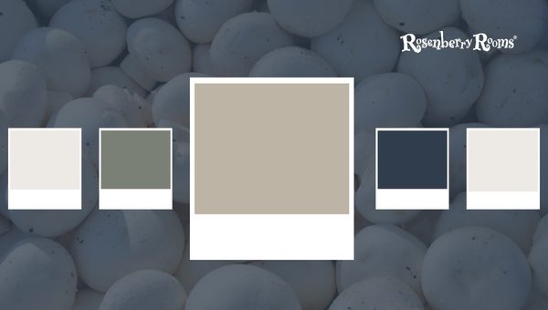
A beautifully calming hue, Stone Hearth CC-490 instantly conjures a sense of organic connection and peace in a room. Here are some defining features:
Stone Hearth CC-490 carries warmth in its undertones, reminiscent of wooden landscapes or a calming desert safari.
The beige-brown infused color encapsulates comfort and tranquility with a touch of class. This versatile warmer shade is adaptable to different decorative styles, from contemporary to rustic chic. It is everyone's go-to color choice for living rooms, bedrooms, and office space.
The 'easy adaptability' of Stone Hearth CC-490 makes it visually attractive when paired with darker hues like midnight blue or brighter tones like lemon yellow.
This splendid combination adds depth and harmony to your room while not overwhelming the senses.
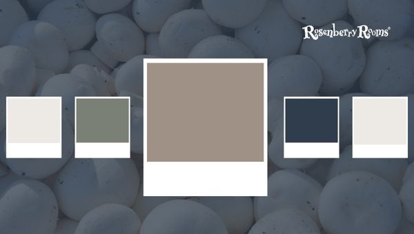
Sticks & Stones SW 7503 is an ingenious blend of earthy gray and soft brown tones providing unprecedented dynamism to any room you apply.
Features include:
The 'neutral' aspect of Sticks & Stones does wonders in accommodating most contrasting styles and materials such as metals, ceramics, or natural stones.
The fact that it helps create a cohesively stunning environment where all decor elements complement each other sets this color apart.
This mushroom hue has an additional charm that empowers it as the perfect backdrop, whether showcasing your antique furniture collection or blending harmoniously into modern artwork displays - 'your cherished assets take center stage while Sticks & Stones SW 7503 unassumingly binds them together.'

Having Minimalist SW 9611 on your walls feels like daylight spilling across your room when the curtains lift - gentle, radiant, uplifting!
Wow factors are:
A 'light gray-toned hue like Minimalist brings potential brightness into your environment without being overly sterile or cold – contributing to spaciousness and relaxation all at once.
It works splendidly used in master bedrooms or bathrooms because beyond being exceedingly stylish - there lies a calmness – as if guiding you towards zen tranquility!
When combined with earthy decor pieces or vibrant colored art frames – ‘the vivacity pops out more prominently against the serene backdrop of Minimalist SW 9611, initiating enriched visual dialogues.’

Few colors confidently distinguish between warm and cool neutrals as splendidly as Smokey Taupe 983.
Interesting features incorporate:
Smokey Taupe is admired for intertwining charming overlaps between cooler grays and warmer browns ('Gray-brown overlap').
This elusive amalgamation lets it sit comfortably within warmer and cooler colors without looking out of place.
Subtle elegance,' one might say when appreciating Spaces adorned by Smokey Taupe; be they vintage-styled living rooms dotted by ostentatious fireplace mantels or grand chandeliers above dining tables, setting those royal Victorian moods – everything assumes an added aura wrapping themselves within Soft layers of 'Smokey Taupe (Smokey Taupe 983).
To summarize this exploration of mushroom paint colors – they echo subtle sophistication while displaying mind-boggling versatility; mushroom hues rightly enjoy their fan-favorite status from coast to coast across our magnificent homeland! Let’s keep celebrating their essentiality within our homes.
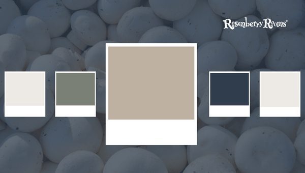
"Loggia SW 7506," a cherished member of the mushroom color family, elegantly bridges the gap between classic elegance and modern sensibilities.
This paint color offers a delightful balance of warm and cool tones, making it an extremely versatile choice.
An outstanding aspect of Loggia SW 7506 is its ability to adopt different imaginations depending on other room elements.
In rooms with ample daylight, you'll notice an earthen touch in this color that comfortably eases into cool evenings, embodying an adaptive ambiance incredibly.
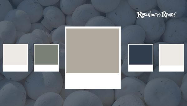
An entrancing color from Benjamin Moore's Classic Color Collection is "Plymouth Rock 1543." This hue strikes the perfect balance between grandeur and subtlety.
Choosing Plymouth Rock as your wall paint means signing up for luxury defined by understated elegance. Whether you prefer minimalist style or bohemian flair, Plymouth Rock 1543 seamlessly accommodates varied décor arrangements, coaxing their distinctive features.

Notably, one of Benjamin Moore’s favorites – the lovable "Bleeker Beige HC-80” flexes impressive compatibility across traditional or modern spaces.
There seemed no superior term than "perfect neutrality" upon witnessing Bleeker Beige HC-80. This foundational base's exceptional blending capabilities are nothing less than pleasing as they allow more exploratory freedom for accents to come alive while maintaining soothing backgrounds.

Venturing towards cooler undertones somewhat distinct within our mushroom palette is Sherwin Williams' masterpiece – the strikingly serene "Anew Gray - SW 7030."
Anew Gray - SW 7030 cannot be tossed away in the standard grays column because of its unique melange marrying neutrals' simplicity yet retaining mushrooms' layered depth—making it ideal for bedrooms veritably imbuing tranquility before bedtime!
Best-suited mushroom paint colors resonate not only with our design preferences but also with our mood aspirations.
It may take several swatches before finding that magical color transformation secret but remember, in this rewarding journey – there’s no such thing as a wrong hue choice.
We imbibe these lasting lessons appreciating the allure that lies within subtle deviations amidst uniformity–pretty much like life itself.
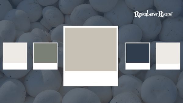
Performing as a chameleon of colors, the Revere Pewter - HC-172 is an exceptional color pick. Lying on the lighter end of the scale.
It offers a unique blend of warm and cool undertones, making it look different in varied lighting conditions. Here are its outstanding features.
Revere Pewter is a classic choice for those seeking a universally appealing neutral that syncs across various styles while being fashionably impactful.

Balboa Mist - OC-27 lies in-between beige and gray hues creating an excellent balance between cool and warmth. Ideal for someone seeking sophistication coupled with practicality from their neutral shade palette.
If you are after crafting graceful spaces that remain mesmerizingly quaint, Balboa Mist could be your go-to shade.

When painting your walls with the enigmatic hue of Worldly Gray - SW 7043, a grandeur hint ensues. It anchors coziness through its warm undertone managing to pull off chic elegance effortlessly.
Knocking on Worldly Gray’s door can lead you to create spaces that carry an enchanted ambiance consistently despite ever-evolving design trends.

Radiating freshness upon applying the elegant shade of greige called the Repose Gray - SW 7015 invites brightness welcome in every homeroom.
Should you strive to create vibrant living areas that scintillate under varied lighting conditions while maintaining neutrality at their heart—then it's time to usher home Repose Gray’s appealing glow!
Selecting mushroom tones requires careful consideration but can bring immense satisfaction and value once correctly chosen for your home's context keeping natural lighting, desired ambiance, and decor themes under focus.
Just like everything precious taking time to curate, enjoy this process without hurrying through it.

Abalone - AF-710 gently aligns itself with the rich ambiance of mushroom hues with a tranquil charm that is unmistakably captivating.
A glance at its gracious grey foundation, brushed generously with subtle beige, leaves an impression of layered depth.
Distinctive Features:
As tantalizing as it sounds on paper, Abalone proves its worth by adding much-needed texture and dynamism to your walls.

The magnetic charm of Agreeable Gray – SW 7029 is compelling due to its classic neutrality that strikes an excellent balance between beige and gray undertones without being overwhelmingly warm or cold; hence Agreeable!
Distinctive Features:
This is your color for those seeking neutrality that doesn’t blend too much into the background but stands just enough out.

Accessible Beige SW 7036 is a top-notch player in mushroom paint colors. This versatile shade embodies the seamless blending of beige and gray, creating a chameleon-like quality that is unique and highly desirable.
Choosing to go with Accessible Beige - SW 7036 guarantees a timeless elegance that remains on-trend year after year while creating an environment conducive to relaxation.
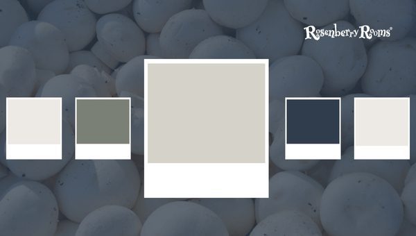
Pale Oak OC-20 undeniably captures the essence of understated luxury and casual refinement typically associated with mushroom hues. Like a whisper of comfort floating across your spaces, it adds style without overpowering other elements.
The soft elegance combined with substantial depth in Pale Oak - OC-20 earns rave reviews from homeowners and seasoned designers alike!
Living up to commendable reviews from experts and users alike is no small feat—one which Collingwood OC-28 pulls off gracefully.
Brimming with chic sophistication coupled with laid-back appeal speaks volumes about this trendsetter!
Investing in Collingwood - OC 28 brings forth a winning blend of striking contemporary flair and cozy, lived-in vibes making your home feel exceptionally welcoming.
These masterpieces from Mushroom paint colors imbibe diversity within unity—a common thread runs through each, brilliantly unified by sophistication yet diverse enough to suit different aesthetics.
Remember—design thrives best when personal touches infuse their charm into professional advice; let these recommendations inspire but cultivate your uniqueness.
They get their name from their similarities with the color of portabella mushrooms, amalgamating beige, taupe, and gray.
Mushroom paint colors work well in all spaces, from living areas and kitchens to bedrooms and bathrooms, due to their neutral tone.
Yes, their versatility lies in balancing warm and cold undertones, making them ideal for traditional elegance and modern flair.
Absolutely! They can make smaller rooms appear more prominent due to their light hue and ability to reflect light gently.
Popular choices include Agreeable Gray - SW 7029, Balanced Beige SW 7037 but it truly depends on your personal taste, spaces' lighting & furnishings.
As we slide the curtain close on my top picks from the most delightful mushroom paint colors, it's worth reasserting their incredible scope for creativity.
They provide an abstraction of warmth, subtlety, and understated elegance into your everyday living while ensuring your home reflects your style and personality.
From stunning entryways with Accessible Beige - SW 7036, comforting living rooms in Pale Oak – OC-20, or chic bedrooms in Collingwood - OC 28, remember there’s a shade for every whim and mood.
So, transform your house canvas with alluring mushroom hues; it's time to breathe life into your walls.