If you’ve been searching for the perfect hue to spruce your space, your quest ends here. In our Benjamin Moore Quiet Moments 1563 color review, we’ll delve into everything that makes this shade unique and loved by designers and homeowners alike.
Whether you’re planning to refresh your kitchen, bedroom, or any other area of your house, this gorgeous paint color has something for everyone.
You might be curious why this particular shade draws all the attention. With its ability to create a serene atmosphere subtly blended with sophistication, Benjamin Moore’s Quiet Moments 1563 tends to leave a magical impact on any room it adorns.
But there’s so much more than just this captivating allure; let’s dive deep into the world of this vibrant color and see how it can transform your living spaces.
Contents
When considering the aesthetic appeal of Benjamin Moore’s Quiet Moments 1563, it’s easy to understand why this hue is so popular.
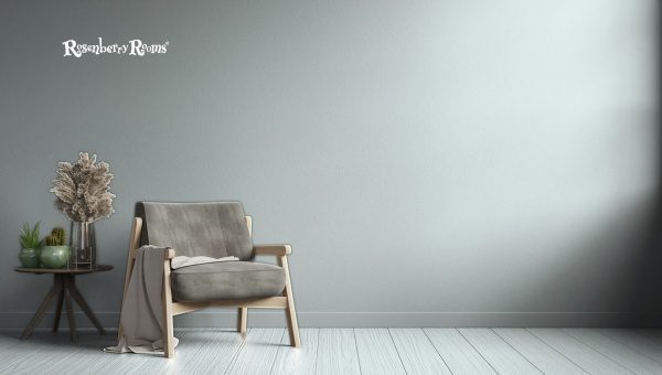
This shade is a calming, tranquil combination of light blue and gray tones, making it an ideal choice for creating a serene atmosphere in your home.
The versatility of the color also stands out – it works well with various decor styles and designs, from contemporary to rustic. This sophisticated color adds an understated elegance that effortlessly enhances any space it graces.
Benjamin Moore Quiet Moments 1563 has a Light Reflectance Value (LRV) of 60.73. The LRV measures how much light a color will reflect compared to white, which reflects 100% of the light.
An LRV of 60.73 suggests that this shade of paint is moderately light and keenly reflects over half the light it receives, making it an ideal choice for rooms you want to keep looking bright and spacious.
Colors with high LRVs are often recommended for small spaces as they help enhance the feeling of openness.
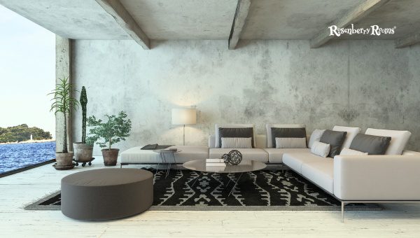
This cool and tranquil marine-inspired greenish-blue color has versatile adaptability, can blend well with various interior themes, and creates an aura of serenity.
Benjamin Moore Quiet Moments 1563 is considered a cool paint color. Cool colors are often associated with elements of nature, such as the sky, water, and vegetation. These colors can create a calm and relaxing environment when used in interior design.
In particular, Benjamin Moore’s Quiet Moments 1563 is a greenish-blue shade with gray undertones that mirrors the serene ambiance of a quiet morning next to a clear river or the gentle whispering of sea waves. In lighting conditions, this color exhibits soothing shades akin to marine environments.
This cool color palette could be ideal for bedrooms or office spaces requiring tranquility and focus. Also, Cool colors have been empirically proven to create an aura of spaciousness and can instill a sense of coolness in warmer climates.
This shade combines perfectly with other cooler tones and contrasts effectively against warm hues for balance. Accents like white and neutral tones can also enhance its inherent sophistication.
Benjamin Moore’s Quiet Moments is undeniably about encapsulating the stillness and freshness of nature’s quiet times in your living spaces.
Read More: Benjamin Moore Pashmina AF-100 [Paint Color Review]
The unique color composition of Benjamin Moore’s Quiet Moments makes it a versatile choice for interior design. Its subtle shades of blue-gray lend an air of serenity and tranquility, making it a fitting selection for many rooms throughout your home.
Equally versatile across various lighting scenarios (natural and artificial), Benjamin Moore’s Quiet Moments is quite forgiving when establishing synchrony within interior design choices.
Its talent to blend gracefully while standing out tastefully makes this hue not just a paint selection but also an integral part of your room’s personality.
It’s vital to understand that paint can look significantly different on your walls than on a color chip. Lighting in your house, surrounding furnishings, and the unique features of your space all interact with the color to create a personalized viewing experience. Sampling is like doing a dress rehearsal before the main event.
By testing a small section with Benjamin Moore Quiet Moments 1563, you’ll see exactly how it will appear in your home and ensure no surprises when you finish painting. Investing in a sample pot is always better than committing blindly to several gallons of paint.
The impact of light on paint can’t be overstated. Variations in lighting can drastically change how you perceive the color Benjamin Moore Quiet Moments 1563 on your walls.
Changes in light at different times of the day can alter the perceptions of this color, making it appear different from morning to evening.
North-facing rooms tend to have cooler and softer quality light. In these spaces, Benjamin Moore Quiet Moments 1563 will lean more towards its gray tones.
On the contrary, south-facing rooms have warmer, more intense light that can intensify the blue hues in the shade.
In essence, one color offers you variable experiences based on its interaction with the directionality of light encountered.
The effects of east and west-facing lights are contingent upon the time of day you observe them. Under Eastern sunlight during sunrise, this shade acquires a cooler persona as crisp blue undertones emerge vividly in this illumination’s radiant glow.
Conversely, finding shades morphing into a hint of gray in a room with Western exposure that gets plenty of afternoon light isn’t surprising.
Northern lights pull out more grey while Southern-enhanced rooms will lean towards blue; Morning light emphasizes cool blue undertones, whereas afternoon and evening lights bring out an element of warm grey to the tranquility that exists at heart with Benjamin Moore’s Quiet Moments 1563.
Bringing the perfect blend of sophistication and tranquility, Benjamin Moore Quiet Moments is an excellent choice for creating serene interiors and works wonderfully for refreshing outdoors with an elegant appeal.
For the exterior, it is generally recommended to use two shades darker than the original hue when deciding on a large surface. Let’s dive into how you can incorporate this shade into your home’s exterior design:
The strength of Benjamin Moore’s Quiet Moments lies in its versatility. As much as it suits modern homes with white and pastel-colored themes, it also elegantly complements traditional homes dressed more heavily in bricks and brownstones to refresh their looks for years.
Benjamin Moore Quiet Moments 1563 is characterized by light-toned blue-gray undertones. An undertone lurks beneath the primary color you perceive when you look at a paint swatch or painted wall.
In the case of Quiet Moments, while the dominant color is a greenish-blue, a closer look reveals subtle, light-toned blue-gray undertones. This gives the hue an exceptional ability to echo cool serenity and soothing elegance.
These subtle blue-gray undertones can become more visible under different lighting conditions or when paired with specific colors in your interior design.
These underlying colors can make Benjamin Moore Quiet Moments feel fresher and cooler, enhancing its suitability for creating tranquil spaces.
Explore More: Benjamin Moore White Down OC-131 [Paint Color Review]
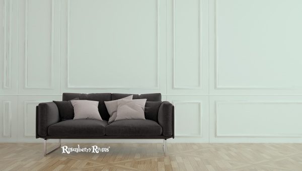
Choosing the right trim color is crucial in highlighting the beauty of Benjamin Moore’s Quiet Moments. A contrasting trim can frame your wall space and add depth to your room, emphasizing the paint color’s unique attributes.
Beyond these options, selecting trim colors also depends on your personal preference and the overall aesthetic of your space.
In Benjamin Moore’s extensive palette, numerous other hues can provide an exciting contrast or harmonious blend with Quiet Moments 1563.
If you’re drawn to the tranquil ambiance of Quiet Moments but unsure if it’s the perfect match for your space, there are similar colors to consider. Each one carries its unique variant of versatility and tranquility.
These colors offer similar aesthetics but bring their unique character into your space. Make sure you experiment with swatches to find the perfect one that caters to your taste and light conditions.
Also Read About Benjamin Moore Super White OC-152 [Paint Color Review]
Quiet Moments 1563 provides an idyllic, calming ambiance, making it perfect for nurseries.
In low light conditions, the shade tends to lean more towards its cooler gray tones, adding warmth to the room.
Absolutely. The tranquil feel of this hue lends itself well to creating peaceful, productive office environments.
Its soft blue-gray undertones complement the wood finishes beautifully, highlighting their warm hues.
Definitely! It’s especially appealing on front doors or trim, providing a sophisticated and inviting exterior appeal.
Benjamin Moore Quiet Moments 1563 is a soothing blend of tranquility and elegance that effortlessly enhances any space.
Whether you’re freshening up a room or completing an exterior makeover, its subdued blue-gray hues seamlessly complement a variety of undertones, trims, and other furnishing, giving you endless possibilities in your design journey.
Choosing Quiet Moments 1563 is not just about picking out a paint color for your walls; it’s about setting the mood and creating an ambiance of serenity in your living space. With this shade, a quiet moment isn’t hard to find.