So, you’re on the brink of a remodeling project, and you’ve just come across the enigmatic Benjamin Moore Nimbus 1465.
Something about this color piques your interest, but you can’t quite place your finger on it. Could Nimbus 1465 be the hue that transforms your space into an oasis of tranquility?
In this blog, Benjamin Moore Nimbus 1465 Color Review, we’ll peel back the layers of this subtle neutral and delve deep into its nuanced tones.
Each color holds a unique identity; our task is to enlighten you on whether Nimbus 1465 matches yours. We’ll journey together through its characteristics, compatibility with other colors, and where best to use it in your house. Hang tight; this might be the perfect solution to your color quandary.
Contents
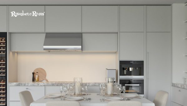
Enveloping your senses with its mellow charm, Benjamin Moore Nimbus 1465 is a gray, neutral paint color that creates soothing atmospheres with nuanced undertones.
It gives your space a refreshing aesthetic without overwhelming, striking a harmonious blend between stark whites and deeper tones.
Understanding Light Reflectance Value (LRV) is critical when selecting paints. Here’s why:
Benjamin Moore Nimbus 1465 scores an LRV rating 59.4, putting it in the medium range. This translates into a color that brings enough light into your room without causing glare.
Understanding such nuances is essential to make informed decisions about painting your home. Take time to visualize how Nimbus 1465 would envelop your walls and affect the overall ambiance, considering its core features and reflecting attributes before you plunge in!
Alongside considering aesthetic appeal, pay heed to practical aspects like reflectivity, which directly impact the perception of space and energy efficiency.
Also Read: Benjamin Moore Muslin OC-12 [Paint Color Review 2024]
The undertones of a paint color provide depth and complement its dominant shade. Regarding Benjamin Moore Nimbus 1465, the magic’s in the mystique.
This color carries subtle green and purple undertones, lending it a unique character. The result can best be described as a moody silvery blue-grey that changes and adapts according to other hues in the room.
Take note, though. Lighting plays a significant role here. Under natural light, Nimbus may lean slightly towards silver-blue, while its reclusive blue-green tones may sparkle up under artificial lighting conditions.
Colors can have temperament based on where they fall on the warm-cool spectrum. It impacts how you feel inside your space.
Nimbus 1465 doesn’t play extremes; it’s a neutral gray lying near the middle ground of this spectrum. That means it leans neither too cool nor too warmly, which is great because it won’t impose upon you an aura of overwhelming chilliness or coziness but maintains space balance consistently.
Remember, your temperament influences color temperament; try to match these vibes when you’re picking your paint.
Suffice it to say then that when it comes to versatility and adaptability, Nimbus 1465 offers a delightful case study thanks to its intriguing undertones and balanced temperament.
When incorporating Benjamin Moore Nimbus 1465, you add a versatile hue to your color palette. It is perfect for those who want an alternative to white or beige but still wish to maintain an understated elegance.
Experts often recommend this neutral gray for interior and exterior applications due to its adaptable hue and demeanor.
While some colors may exist in the background, Nimbus 1465 actively shapes your interior spaces. When applied well, it brings a sense of tranquility while keeping the part dramatic.
Remember that nimbus will look different based on other adjacent colors and elements – try it on multiple walls before finalizing it if possible!
Crafting an inviting facade sets the tone for what lies inside your home. Here’s where Benjamin Moore Nimbus fits in seamlessly.
Being a lighter color, it does well with sunlight and brings out architectural details beautifully against natural backdrops.
Have wooden elements? This gray pairs well with such materials and can add sophistication to your home’s exterior look.
Consider playing with contrasting trim colors like whites or deeper grays for that extra degree of visual appeal without turning ostentatious.
Also Read: Sherwin Williams Big Chill SW 7648 [Paint Color Review 2024]
Applying Benjamin Moore Nimbus 1465 to your home’s exterior adds visual interest and enhances its overall appeal.
This paint shines brightly under different lighting conditions, subtly reflecting the changes in natural sunlight throughout the day.
The inherent adaptability of Nimbus 1465 pairs beautifully with various architectural styles, from classic Cape Cod houses to contemporary minimalistic structures.
Due to its balanced shade, this shade makes your home stand out while seamlessly blending into the neighborhood landscape.
Regarding material compatibility, Nimbus 1465 pops stunningly against red brick facades and complements wood finishes and stone accents.
Therefore, when looking for a timeless color that adds curb appeal and makes a statement, Nimbus 1465 should be high on your consideration list.
Selecting the perfect paint color can be daunting. To ensure you absolutely love Benjamin Moore Nimbus 1465 in your own settings, opting for a sample before investing in gallons is wise.
Your space is unique, and what you observe with the sample will be closest to how the results look. Providing due diligence at this stage assures delight upon job completion.
Choosing the right trim color is a crucial consideration that significantly enhances the beauty of Nimbus 1465.
The rule of thumb is straightforward: select a trim color that complements and contrasts effectively with this grey neutral to highlight your space’s architectural details elegantly.
As you may know, trim colors can dramatically enhance your main wall color and make design elements pop.
Think door rims, window frames, or even baseboards – all these areas can be spruced up with the proper trim shades.
If you’re wondering which colors best complement Nimbus 1465 for trims, easing your stress is the least we could do! Here are three handpicked options for you from Benjamin Moore’s palette:
While working with Benjamin Moore’s colors makes it easier to find complimentary trims, Nimbus’s flexibility opens doors to experimenting with various brands and their unique offerings.
So you’re intrigued by the stats, subtlety, and sophistication of Nimbus 1465 but also considering options? We’ve got you covered! Here are the top contenders for alternatives in the same color spectrum.
Read More About Sherwin Williams Sweater Weather SW 9548 [Paint Color Review]
Each of these paints offers something unique, similar to Nimbus: versatility paired with simplicity and elegance.
You can decide which paint best suits your needs by comparing these values—including the LRVs, undertones, and other distinct features.
However, every color has a charm that renders differently across diverse spaces. Therefore, we recommend testing them out individually before committing.
Nimbus 1465 creates a tranquil and calm atmosphere due to its well-balanced, neutral hue.
The color may lean towards silver-blue in natural light and display hidden blue-green undertones in artificial light.
Absolutely! This color highlights architectural details and goes well with natural outdoor elements.
It has an LRV of 57.16, which falls into the medium range, effectively brightening rooms without causing glare.
White Dove OC-17, Chantilly Lace OC-65, and Chelsea Gray HC-168 from the Benjamin Moore palette are great options.
If you’re searching for a refined, serene color that radiates tranquility, Benjamin Moore Nimbus 1465 could be your perfect match.
Its unique blend of nuanced undertones and balanced temperament make it a highly versatile hue for any room.
It smoothly incorporates into your interiors and exteriors effortlessly while maintaining an understated sophistication.
Every developed detail from LRV to compatible trim colors underscores that with Nimbus 1465, you’re not just opting for any color – you’re choosing aesthetic excellence, comprehensive functionality, and the potential to turn your space into a veritable sanctuary.