There's a certain charm that resonates from the classic grayscale color palette. The simplicity and versatility are its standout points; this ensured it remained popular for years in interior décor and exterior design.
Among the grayscale options, one hue, in particular, stands out from the rest - Benjamin Moore Coventry Gray HC-169.
It might sound slightly cliché to wax lyrical about a paint color, but we are discussing Coventry Gray HC-169.
This gray hue is a cut above the rest, enveloping your space with its sophisticated charm that thrives in almost any lighting condition.
It is subtler than your usual stark grays, embodying an inviting warmth that makes it perfect for any room in your home.
Contents
While paint swatches can never entirely encapsulate the hue, they give you an idea of what it resembles. So, the first question on your mind might be - what color is Coventry Gray HC-169? Is it a stark, cold gray, or does it lean towards a warmer undertone?
Benjamin Moore Coventry Gray HC-169 falls under the Historical Colors Collection. This collection draws inspiration from 18th and 19th-century American architecture, featuring hues that complement traditional and contemporary spaces.
Coventry Gray belongs to the yellow-green hue family, which means even though it's a grayscale color, there's a subtle undertone at play here. It drifts away from conventional gray colors into something more intimate and welcoming.
Once applied, you're greeted with a medium-toned grey that borders on being blueish due to its cool undertones. But don't make the mistake of assuming it to be just another blue-gray paint!
The essence of this color is its unique complexity. Whether seen under artificial light or in natural daylight, Coventry Gray morphs beautifully in different lighting scenarios.
The shift from a warmish gray in daylight to cooler blue tones under artificial light adds an element of surprise that will never fail to catch your eye!
So, whether you're looking for Best Selling Paint Colors or colors apt for vinyl application, Coventry Gray HC-169 is your best bet! It offers an ethereal blend that is timeless yet striking in style - tuned perfectly for modern living!
Understanding the undertones and Light Reflectance Value (LRV) of paint color is crucial to accurately predict how it will look in your space. And that's what we are discussing next for Coventry Gray HC-169.
Undertone is the hue appearing beneath the primary color when light hits it. It's almost like a hint or a whisper of another color peeping through the main shade. This phenomenon significantly impacts how Coventry Gray looks on your walls or cabinets.
Despite being classified as gray, Coventry Gray carries subtle undertones that set it apart from traditional grays. In different lighting, you'll notice delicate hues of blue peeking through - rendering this color its signature cool undertone.
Yet, while some might associate this blue undertone with a sense of coldness or starkness usually found in blues and grays, don't be deceived! On the contrary, Coventry Gray has an unexpectedly warm feel that can create an inviting atmosphere in your home.
On the other hand, the Light Reflectance Value (LRV) tells us how much light a particular color reflects back. Measured on a scale from 0 (black) to 100 (white), lower values indicate darker colors that absorb more light, while higher scores denote lighter hues reflecting more light.
Coventry Gray HC-169 has an LRV of 48.18. This medium-range LRV means it sits comfortably between being too dark or too bright - providing just the right amount of light reflection to maintain its rich depth. At the same time, ensuring spaces don't appear oppressively dark.
Its medium LRV makes Coventry Gray neither overwhelmingly dominant nor outshined by other colors in your décor palette. Perfectly balanced between being a statement and backdrop color, it effortlessly anchors your space with subtlety and grace.
So there we have it – understanding these attributes can help you appreciate why Benjamin Moore's Coventry Gray HC-169 has fascinated many homeowners.
Also Read: Benjamin Moore Hale Navy HC-154
Navigating through the maze of finding the perfect paint color for your house can be arduous.
Especially when it comes to grays, the spectrum is vast and intricate. So let's delve into one of the most fundamental aspects of our discussion - Is Benjamin Moore's Coventry Gray a warm color or a cool one?
"warm" colors typically have undertones like red, yellow, or orange. They create an inviting and cozy atmosphere in any given space. Although Coventry Gray is categorized as a gray shade implying coolness, here's an exciting twist.
When exposed to certain types of light, specifically during daytime under natural light's glow, the color looks slightly warmer. It showcases a gentle warmth that isn't very common among grays.
Think about an overcast sky just post-rain; that comforting ambiance is exactly what I'd picture when seeing Coventry Gray in this light setup.
We can take away from this that despite its complex characterization, Coventry Gray displays a surprisingly warm dimension under specific lighting arrangements.
As I've mentioned earlier in our exploration of undertones for this particular hue, we know that Benjamin Moore's Coventry Gray leans towards carrying a cool blue undertone.
Under artificial lighting or during late afternoon hours as daylight fades, this blue undertone becomes more prominent. It gives the space painted in HC-169 an inherently calming aura as if mimicking quiet dusk-time skies.
Is it warm or cool? Astonishingly enough, it's both! The primary takeaway from understanding this dichotomy within Coventry Gray HC-169 allows it to be universally adaptable and has amassed widespread popularity over time.
Now that we've uncovered valuable insights into its character let us discuss where you can use Benjamin Moore’s Covetry Grey HC-169.
One of the outstanding virtues of Coventry Gray HC-169 is its adaptability. This versatile hue beautifully lends itself to different home decor elements, from furniture and cabinets to bedrooms and bathrooms. Let's delve deeper into each one.
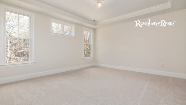
When painted on bedroom walls, Coventry Gray is no less than an oasis of calm. Its soothing aura triggers an almost meditative state - perfect for creating a sanctuary from the daily grind.
For an ultra-luxe vibe, pair it with crisp white bedding set off by navy accents in throws or cushions. Alternatively, warm it with wood tones and soft neutrals like beige and ivory for cozy allure.
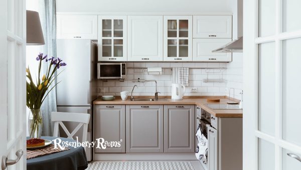
Treat your kitchen to some much-needed upliftment by painting cabinets in Coventry Gray! It beautifully brings out the charm of white marble countertops while contrasting stunningly against brass hardware. Similarly,
In bathrooms, vanity units adorned in this sophisticated color against wall tiles of lighter shades (like whites or pastel yellows) can transform them into lovely havens. Also worth trying: pair these majestic gray cabinets against subway tiles for an uber-chic modern look!
Dominating bathroom walls, Benjamin Moore's Coventry Gray instantly carves out an elegant space one wouldn't mind unwinding after a long day's work!
A shower curtain carrying light gray stripes against an airy white background will complement beautifully while keeping things fresh.
Pro tip: For smaller bathrooms that receive ample natural light – try partnering this color with bright white trims and fixtures to expand the space visually.
As you can see from these examples, there are endless possibilities when incorporating Benjamin Moore's Coventry Grey HC.
Also Read: Benjamin Moore Stonington Gray HC-170
The effectiveness of color lies in its versatility. And, when it comes to this, Benjamin Moore's Coventry Gray truly shines. Let's dive deep into the world of Coventry Gray as we explore its performance in interior and exterior applications.
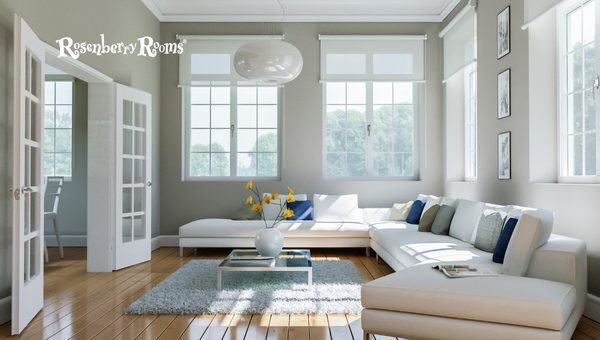
Inside your home, Coventry Gray HC-169 works harmoniously with your interior décor. Its subtle yet inviting tone complements a range of styles, whether contemporary, traditional, or transitional.
Coventry Gray finds its place effortlessly on your living room walls or as an accent color in your dining space.
It can charm your open-plan kitchen or add depth to your bedroom with crisp white bed linen and darker tones.
More than just wall colors, consider using them on cabinets, bookshelves, or centerpiece furniture pieces for a chic makeover.
Its chameleon-like quality allows it to adapt beautifully under different lighting situations – shifting from warm gray at daybreak to cooler gray undertones by dusk.
In spaces with lots of natural light, Coventry Gray appears lighter, with subtle blue undertones peeking through.
Meanwhile, in artificially lit spaces or those with low light conditions like bathrooms without windows or hallways, you can expect depths of gray leaning more towards the cool side.
Transitioning outside the home, Benjamin Moore’s Coventry Gray HC-169 doesn't fail to impress here, either! It is a stunning choice for exterior applications.
Regardless of the architectural style – modern minimalistic residences or traditional colonial-style homes –, Coventry Gray stands out impressively against landscaped greenery and blue skies.
Striking yet unassuming at the same time, this color looks fantastic on siding and external walls contrasted against crisp white trim for that classic look.
In full daylight conditions outside, you’ll again witness those beautiful shifts from warm during bright sunlight hours to cooler gray blues in shadowed areas.
Remember, though, that as is true for any paint color application, surface preparation is key before application outside.
You'll want to ensure proper priming and surface-prepping steps to make the most out of this gorgeous hue!
So yes - Whether inside or outside your home - rest assured that Coventry Gray HC-169 wraps your spaces elegantly with its charismatic presence.
Choosing the right trim color complementing Coventry Gray can elevate your room's aesthetic appeal. Like all great art, it's about achieving balance and harmony, making the trim color selection pivotal to your décor scheme's success. Let's take a look at a few of my top choices:
Whichever trim color you choose should resonate with your style and home aesthetics. Properly marrying these colors will create a seamlessly flowing design that is a pleasure to behold.
Lighting and cardinal directions are significant in determining a paint color's appearance in a specific room.
These components can alter the hue's appearance, either enhancing or undermining its overall effect. This is where Benjamin Moore's Coventry Gray HC-169 truly shines with its remarkable adaptability to shift beautifully under varied lighting conditions and room orientations.
Let's explore how Coventry Gray interacts with different light scenarios in rooms facing various cardinal directions:
North-facing rooms receive less direct sunlight, often casting cooler, bluish light. This could potentially intensify the cool undertones of Coventry Gray.
However, its unique warm feel maintains a balanced atmosphere without coming off as too chilly.
South-facing rooms receive ample daylight throughout the day, with warmer hues that enhance Coventry Gray's welcoming character.
Sunrise brings in soft light into east-facing rooms; hence early mornings are particularly intriguing for Coventry Gray.
West-facing spaces embrace warmer hues as they soak up evening sunbeams gloriously splashing across your walls.
While aspects like artificial illumination (e.g., LED lights) play a vital role, capitalizing on natural light based on cardinal directions remarkably defines how Benjamin Moore's Coventry Gray HC-169 will register on your walls or furniture.
Through being cognizant of this fact lies your power in mastering color dynamics in interior styling.
Trying a paint sample before going all-in with your full-scale painting project is highly recommended. Here are some reasons why:
Remember, paint chips and digital samples are there just for initial shortlisting. For a confident decision, splurge that small extra on a paint sample pot – it’s worth every penny!
So before you invest time and resources into painting your entire room or home with Benjamin Moore Coventry Gray HC-169, grab a sample first! This way, you'll know exactly what to expect before making any significant commitments.
Coventry Gray HC-169 has a versatile outlook that allows it to partner beautifully with a variety of colors. Whether you want to go with something contrasty or complementary, here is a list of colors that pair well with Coventry Gray:
Remember, coordinating colors revolve around the ambience you hope to achieve: softer tones for calming spaces and fuller hues for more energetic impressions. So tailor your picks based on what vibe you're longing to curate!
All these shades are easily accessible from Benjamin Moore's extensive range and can significantly enhance the aesthetic depth of your interiors when used right! So let your creativity run free and bring in those splashes of grandeur with coordinating colors.
The LRV of Coventry Gray HC-169 is 48, reflecting moderate light.
Coventry Gray has subtle undertones of blue, giving it a cool undertone that shifts in different lighting.
Coventry Gray is versatile and can be used for walls in various rooms, furniture, cabinets, and exterior designs.
White Dove OC-17 provides a clean contrast and works perfectly as trim with this gray hue.
Despite the blue undertones that give it a cool look, overall, Benjamin Moore's Coventry Gray leans more towards the warmer side when on walls making your space cozy and welcoming.
Benjamin Moore Coventry Gray HC-169 stands out in the world of grays due to its unique blend of undertones and a balanced Light Reflectance Value.
It perfectly straddles the warm and cool spectrum on walls, creating a fantastic backdrop for your decorative desires.
Whether you want to use it for accent walls, cabinets, or exterior design—it's versatile enough to fit your dreams.
Choosing a color to dress your home can feel like an overwhelming decision. But Coventry Gray offers elegance and adaptability, making it a favorite among many homeowners.
So, dive into the magic of this sophisticated hue, watch how it morphs beautifully under different lighting conditions - you'll be amazed at the charm this new member can bring to your décor family.