Picture this: you step into a dimly lit space, and suddenly, you're transported to the feeling of being inside a cavern. I recall my grandmother's den; it was adorned with deep navy walls, perpetually casting a somber ambiance, regardless of the number of lamps illuminating the area.
Dimly lit spaces present unique design challenges. Lacking ample sunlight, they can often appear cramped, lackluster, and unwelcoming. However, there's a silver lining: selecting the perfect paint shade can completely transform the atmosphere. A new application of paint has the power to make a room feel more luminous, spacious, and even more cheerful, according to 2025 design trends.
Contents
This guide explores the most effective paint colors for illuminating dimly lit areas. From delicate off-whites to serene light blues and inviting warm neutral tones, I'll assist you in discovering the ideal hue to revitalize even the darkest recesses of your living space. Let's begin this transformative journey!
Explore these related articles for further insights and information.
Selecting the ideal paint color for a dimly lit room can present challenges, but considering a few key principles will significantly improve your chances of success in 2025.
For dimly lit spaces, opt for hues that amplify luminosity rather than diminish it. Gentle whites, subtle grays, and airy neutral shades are your most effective choices in maximizing brightness.
Pay close attention to undertones; these subtle color nuances can dramatically shift the ambiance under different lighting conditions. A gray paint exhibiting blue undertones might project an unwelcoming, chilly atmosphere, whereas a gray infused with warmer undertones will cultivate a comforting and inviting space. Consider how these subtle shifts will impact your overall design vision in 2025.
Pro Tip (2025 Update): Before committing, evaluate paint samples on your walls throughout the day. The evolving natural and artificial light dramatically alters color perception!
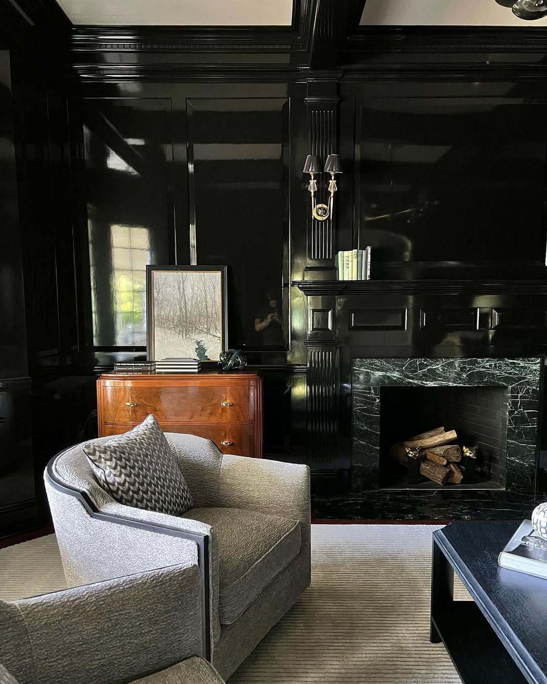
Photography courtesy of averyfrankdesigns
In spaces with limited sunlight, the importance of artificial lighting is amplified. Opting for warm-toned bulbs, which emit a yellow light, can enhance the vibrancy and comfort of colors. Conversely, cooler-toned bulbs may cause colors to appear faded or less saturated, impacting the overall ambiance of the room.
Pro Tip: When evaluating paint swatches, activate your frequently used light fixtures. Observing the colors under your typical lighting conditions, rather than the store's, ensures accurate color representation.
Furthermore, consider the intended function of the space. A serene, light blue could be ideal for fostering tranquility in a bedroom, whereas inviting, warm neutral tones are exceptionally well-suited for creating a welcoming and comfortable living area.
Selecting the ideal paint shade can often resemble the quest for the ultimate personalized beverage – an abundance of options, but only one truly resonates. Fear not, however! Presented here is a curated guide to hues that excel in spaces with limited natural light, infused with practical insights to maintain a sense of familiarity and ease.
In 2025, soft white paint colors remain a top-tier solution for illuminating dimly lit interiors. Their exceptional light-reflecting properties effortlessly transform compact or shadowy areas into bright, airy, and revitalized environments. Opting for shades like Chantilly Lace or Pure White can create a transformative effect, maximizing light distribution while maintaining a cozy and inviting ambiance. These adaptable hues seamlessly complement diverse design aesthetics, serving as an ideal neutral backdrop for showcasing your personal style and furnishings.
Nicole Gibbons, Renowned Interior Designer and Clare's Visionary Founder: "In 2025, the key to maximizing the perception of space in a dimly lit room remains embracing luminosity. Opt for exceptionally bright and open hues, such as pure white or one of our subtly sophisticated, lighter greige tones, to create an illusion of expansiveness."
In 2025, interior design trends favor warm, comforting neutrals such as beige and greige to transform dimly lit areas into welcoming havens. Moving away from the clinical feel of pure whites, these shades introduce a gentle warmth that enhances the space without overpowering it. Notable choices like Accessible Beige and Edgecomb Gray are particularly effective in living rooms and bedrooms, imparting a sense of tranquility while maximizing light reflection. For those seeking a harmonious blend of coziness and luminosity, warm neutrals remain a top-tier selection.
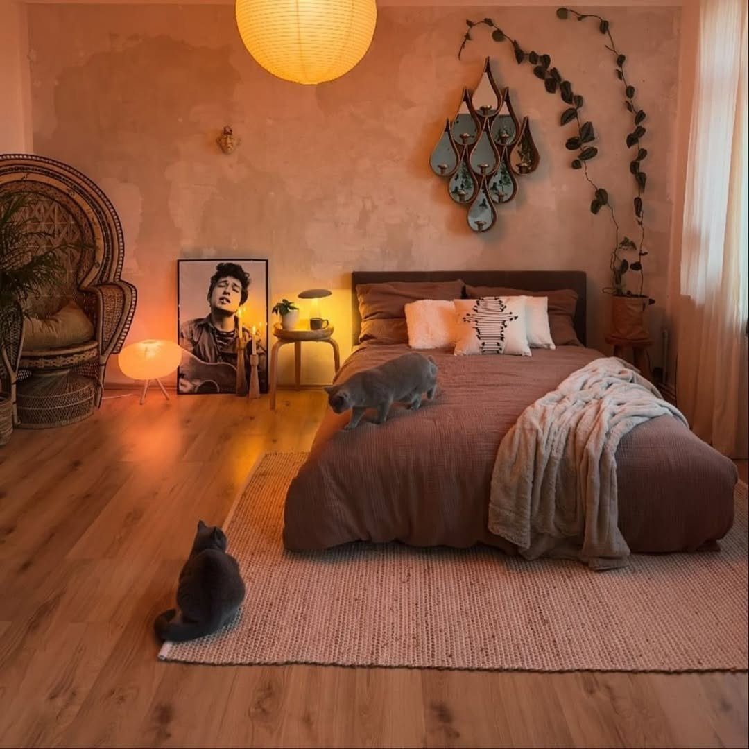
Photo courtesy of homebohodesign
In 2025, light grays remain a top-tier selection for illuminating dimly lit areas, prized for their refined and adaptable nature. Consider hues such as Agreeable Gray or Gray Owl to introduce luminosity without the starkness often associated with brighter whites. These subtle grays harmonize effortlessly with diverse color palettes and material finishes, granting considerable design freedom. Whether your vision leans towards a contemporary, spacious ambiance or a gentle, understated backdrop, light grays consistently deliver exceptional results.
In 2025, soft, muted blues are the go-to for revitalizing dimly lit spaces, fostering tranquility and a sense of peace. Consider shades such as Breath of Fresh Air or Tradewind; these hues emulate the vastness of the sky and the calmness of water, visually expanding the room and enhancing its brightness. Pale blues are exceptionally well-suited for bedrooms, bathrooms, or any area where the desired ambiance is one of relaxation and spaciousness, ensuring the room feels light and unburdened.
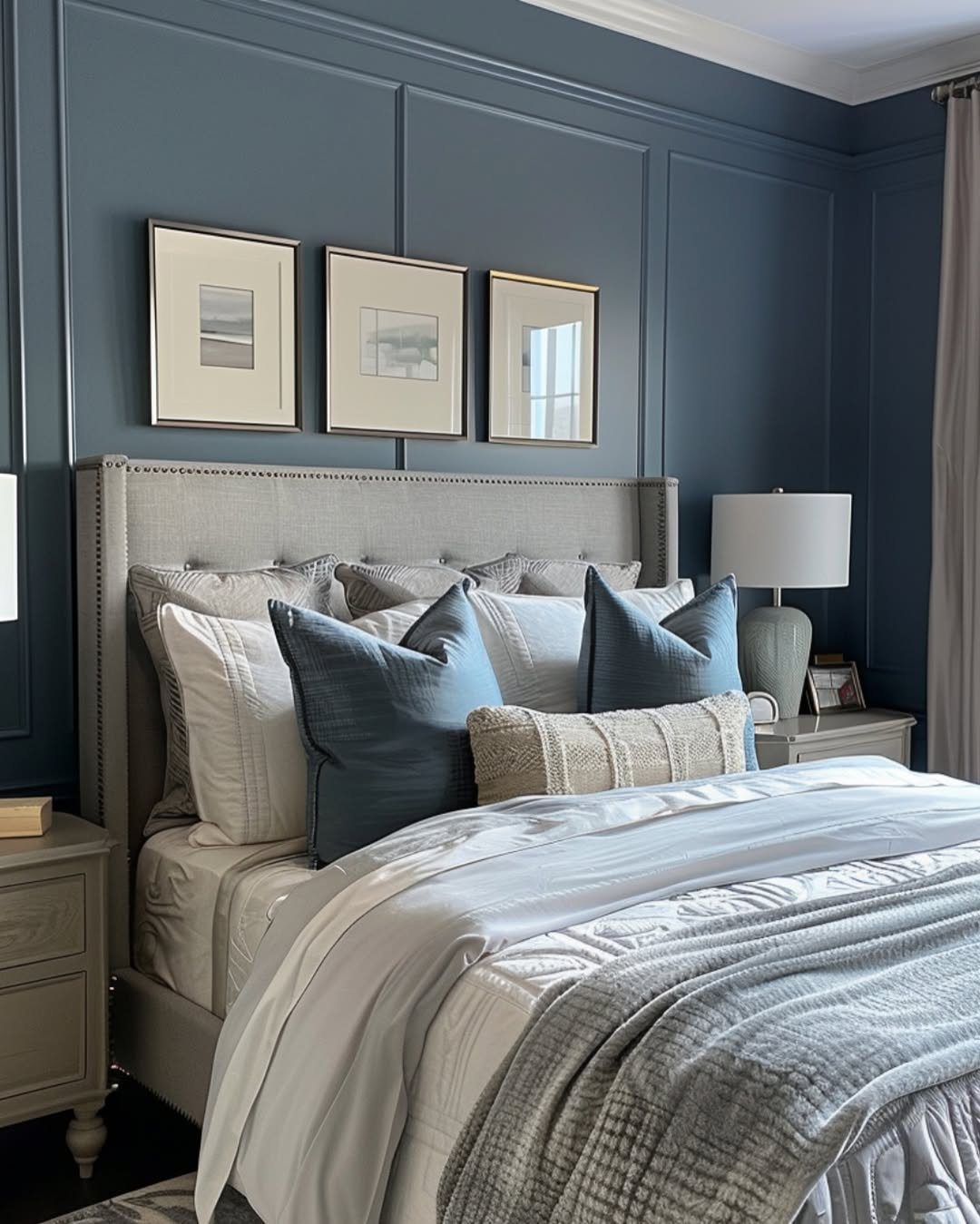
Photo courtesy of simplee.diy
Ethereal greens, such as Sea Salt and October Mist, evoke a sense of grounded tranquility and revitalized energy, presenting an organic solution for illuminating dimly lit interiors. These nuanced hues introduce a delicate touch of color, enhancing the ambiance without dominating the visual landscape, thereby fostering a serene and invigorating environment. Ideally suited for sanctuaries like bedrooms or communal areas, these gentle greens excel in spaces deprived of abundant sunlight, bestowing upon the room an authentic, tranquil essence, perfectly aligned with 2025's design trends.
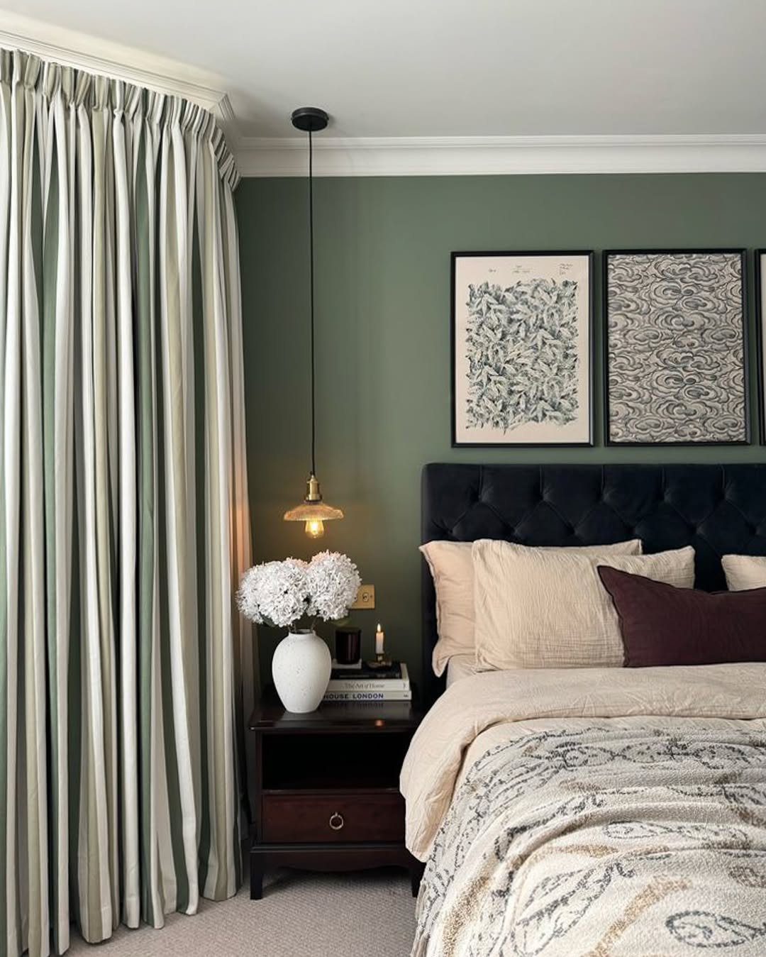
Photo courtesy of lick
Seeking to inject a dose of optimism into a dimly lit area? Consider pastel yellows such as Buttercream or Hawthorne Yellow; they're an excellent solution. These gentle, vibrant hues imbue any space with a sense of comfort and vitality, effectively brightening even rooms lacking natural light. Exceptionally well-suited for kitchens, corridors, or children's play areas, these pastel yellows introduce a delicate radiance that immediately elevates the atmosphere.
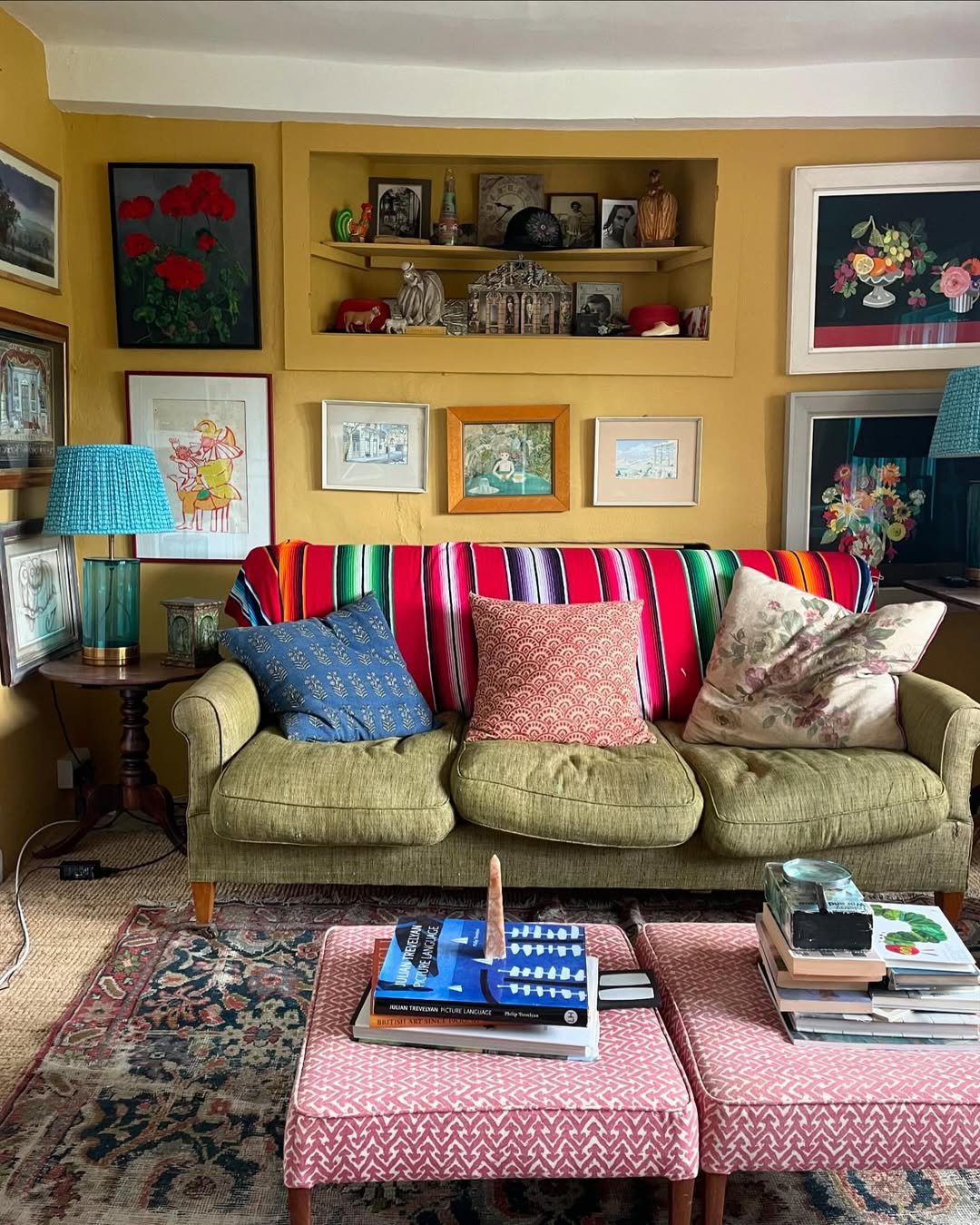
Photo courtesy of roomportraitclub
In 2025, delicate purples such as Violet Whisper and Lilac Haze are emerging as sophisticated choices for revitalizing dimly lit areas. These hues effectively illuminate a room, introducing a gentle splash of color that feels both contemporary and airy. Lavender tones are particularly well-suited for bedrooms or intimate reading corners, fostering a serene and tranquil atmosphere without dominating the overall aesthetic. Opting for these shades is an excellent way to introduce an element of surprise and individuality to your interior design.
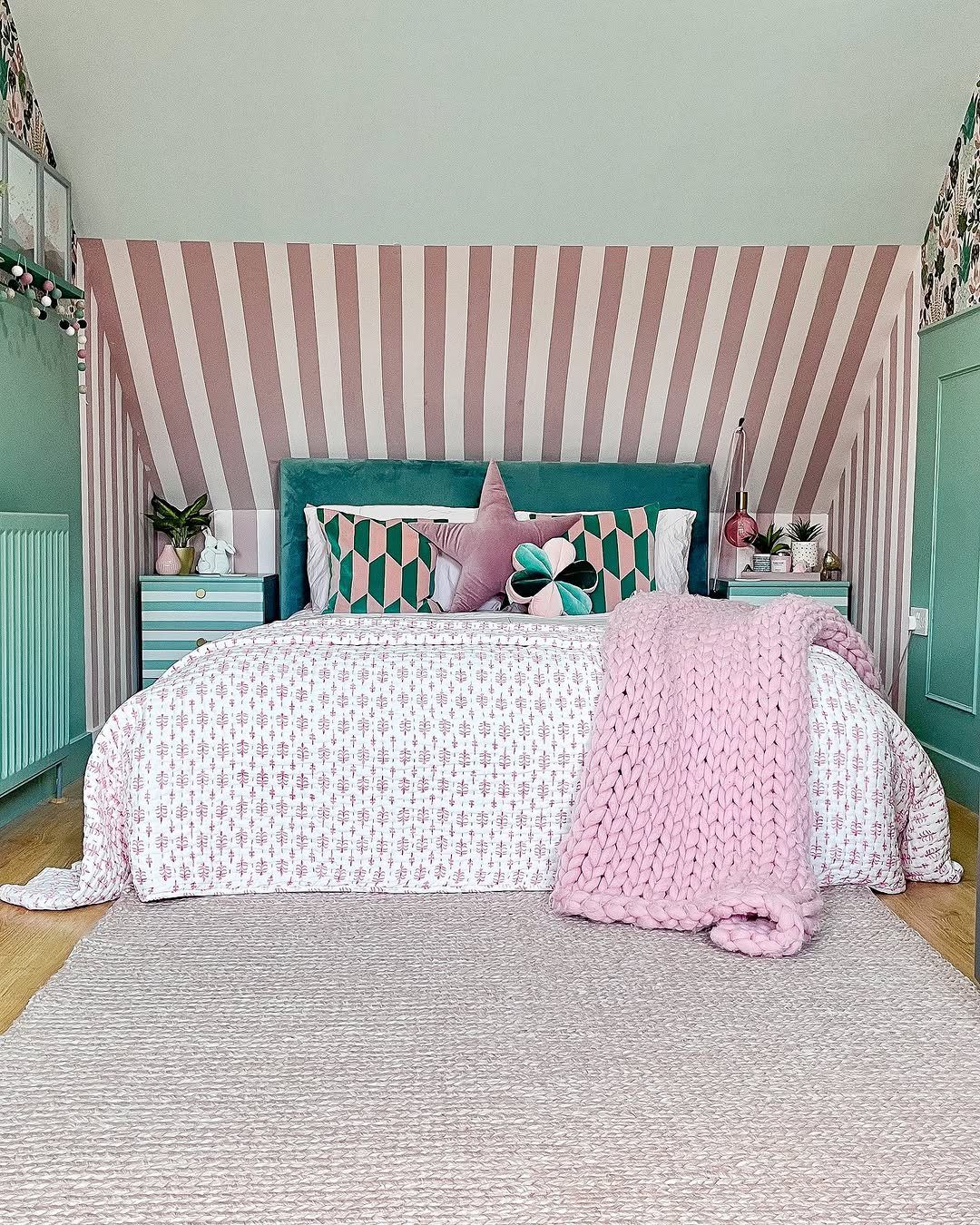
Photo courtesy of hilaryscolourfulhome
In 2025, delicate blush pinks, exemplified by shades like First Light or Pale Petal, continue to be a top choice for infusing dark spaces with a gentle, inviting warmth, avoiding any overly saccharine feel. These sophisticated hues excel at reflecting ambient light, transforming rooms into havens of comfort and understated elegance. Blush pinks are particularly effective in bedrooms and entry halls, lending a touch of refined charm that resonates with both contemporary and classic aesthetics.
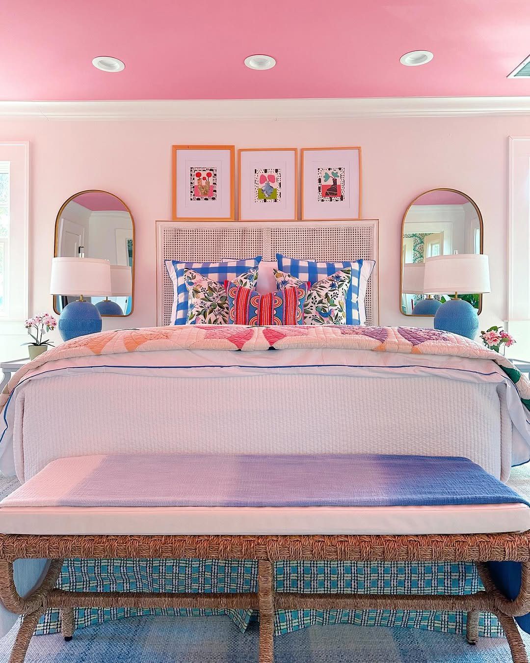
Photo courtesy of shaunaglenndesign
In 2025, sophisticated creamy beiges, such as Navajo White and Natural Linen, continue to be excellent choices for brightening dimly lit rooms, offering a warmer, more inviting alternative to stark white. These hues impart a gentle, radiant warmth, creating an atmosphere that is simultaneously comfortable and luminous. Ideally suited for expansive areas like living rooms and dining rooms, creamy beiges establish a versatile neutral canvas that harmonizes effortlessly with virtually any interior design aesthetic.
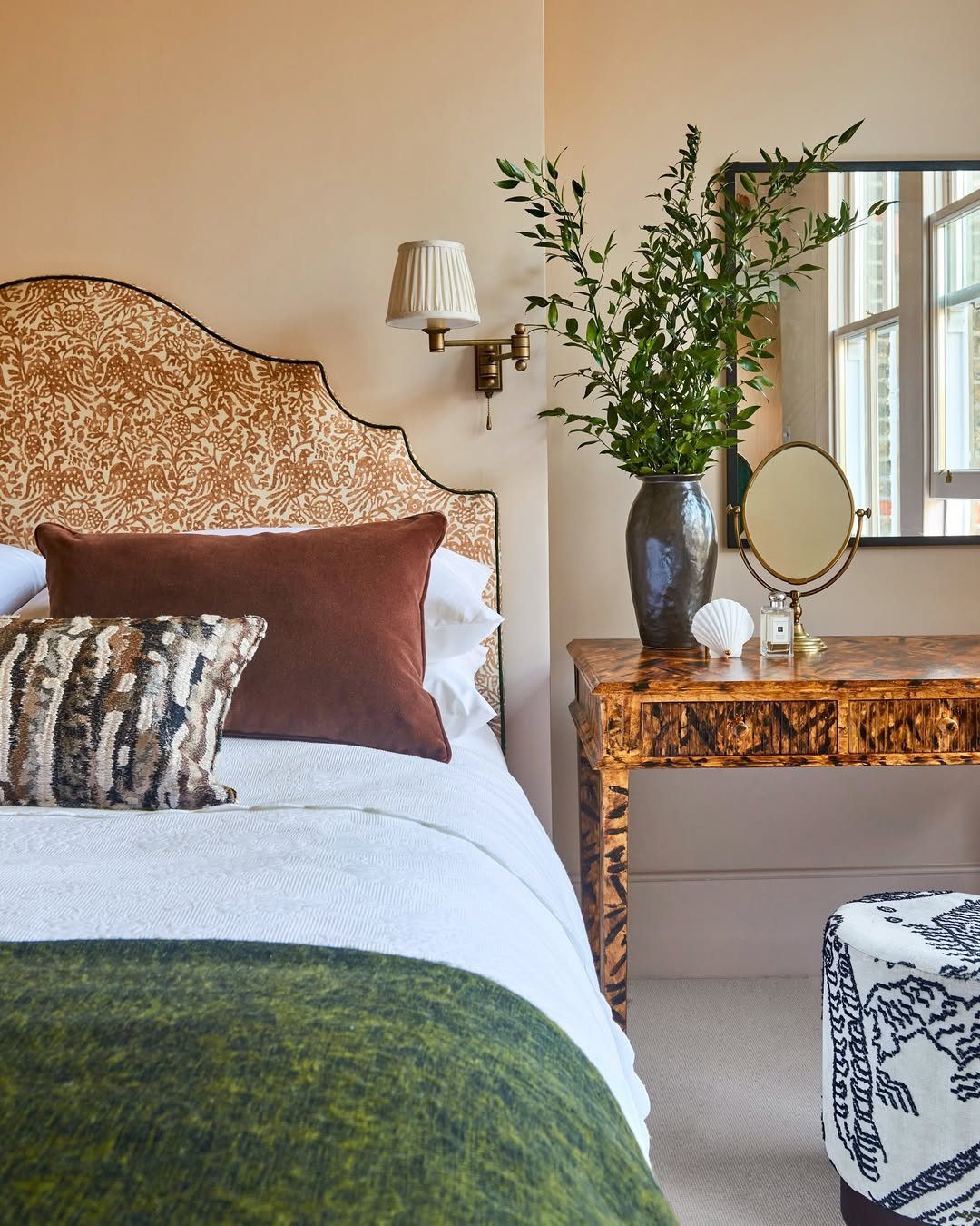
Photo courtesy of sascal.studio
In 2025, muted coral and soft peach hues are emerging as sophisticated choices to infuse dark spaces with a gentle warmth and distinctive character. Consider shades like Peach Fuzz, celebrated as the color of the year, or the equally inviting Apricot Beige, both offering a cheerful ambiance without overpowering the existing décor. These tones are particularly well-suited for bedrooms, bathrooms, or as accent wall colors, where they introduce a balanced dose of color, effectively brightening and revitalizing the overall atmosphere.
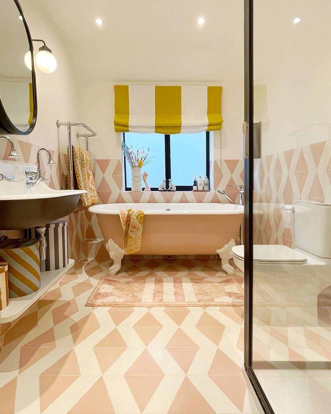
Photo courtesy of houselust
Earthy terracotta hues, exemplified by shades like Casa Blanca, infuse dimly lit areas with a natural warmth, maintaining an air of understated elegance. These shades are ideally suited for enriching the ambiance of living spaces or remote work environments, fostering a sense of stability and comfort. Soft terracotta achieves a harmonious equilibrium between luminosity and warmth, presenting a distinctive departure from conventional neutral palettes, a trend expected to dominate interior design in 2025.
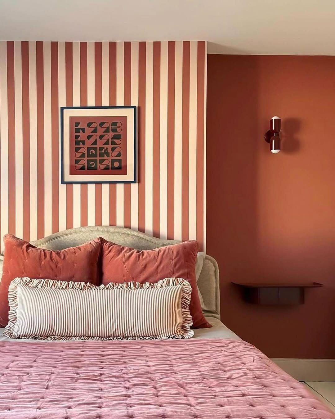
Photo courtesy of lick
In 2025, light taupe remains a top choice for interior designers seeking a versatile neutral. This sophisticated blend of gray and beige provides a gentle, adaptable backdrop, particularly effective in illuminating dimly lit rooms. Consider hues like Timeless Taupe and Whisper Taupe to infuse spaces with brightness without sacrificing warmth or introducing harsh, cool undertones. Perfectly suited for bedrooms and living areas alike, light taupe fosters an inviting and harmonious atmosphere, complementing a wide spectrum of accent colors and design styles.
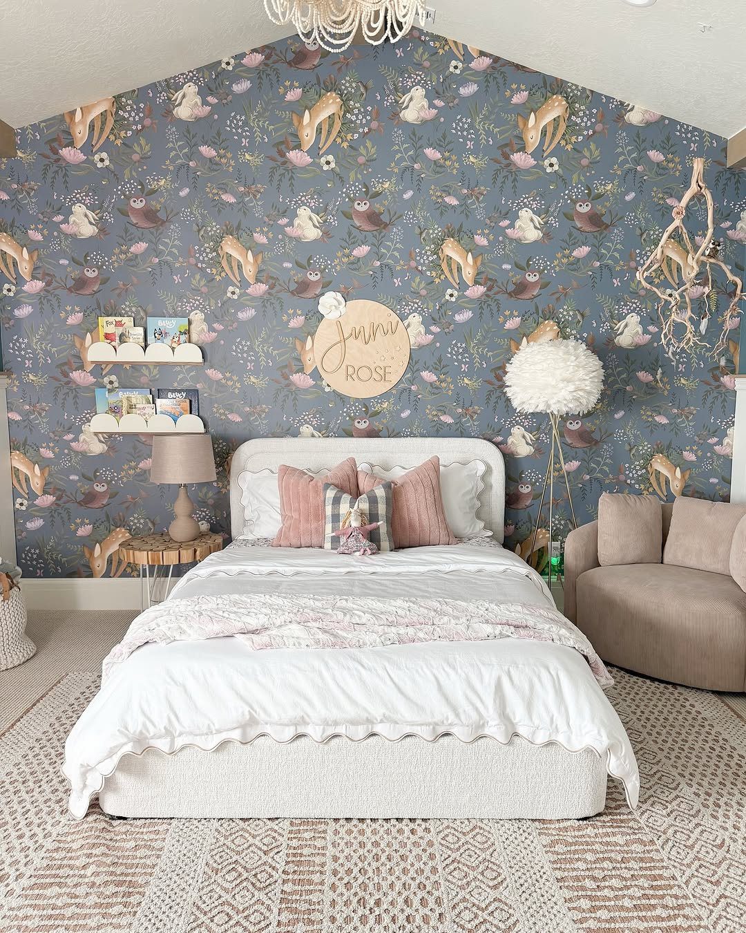
Photo courtesy of remingtonavenue
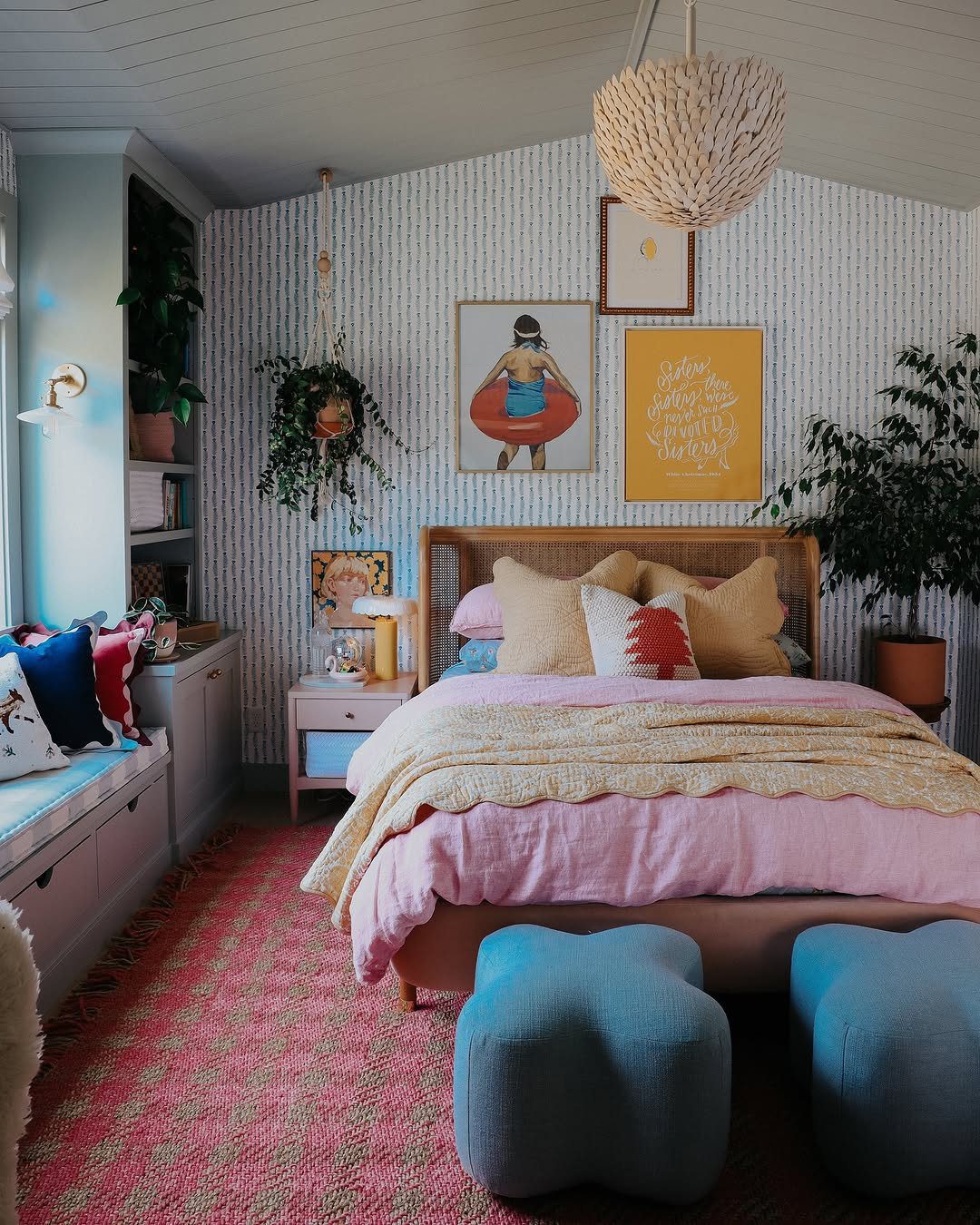
Photo courtesy of nestingwithgrace
In 2025, embrace the serenity of barely-there aqua hues such as Rainwashed and Pale Aqua to infuse your spaces with a subtle whisper of color, maintaining an atmosphere of tranquility and openness. These delicate blue-green shades possess exceptional light-reflecting properties, rendering them ideal for rejuvenating bathrooms, bedrooms, or even compact, poorly illuminated areas. Aqua introduces a revitalizing element, evoking a sense of pristine cleanliness and understated elegance.
If these concepts resonate with you, remember to save the image above to your "Home and Garden" Pinterest board for future inspiration.